November pushed the industry further into AI-shaped discovery. Search behaviors shifted. Platforms tightened control. Visibility started depending less on who publishes most and more on who earns trust across the ecosystem.
AI summaries reached Google Discover. ChatGPT released a browser. TikTok exposed true attribution paths. Meta refined placements. Google rolled out guardrails for AI-written ads. Social platforms changed how your data trains models. Streaming dominated households, and schema picked up a new strategic role.
Here’s what mattered most and how to stay ahead.
Key Takeaways
• AI is rewriting the click path. Google Discover summaries and AI Overviews are reducing CTRs across categories. • Cross-channel influence is becoming measurable. TikTok attribution now shows how much value standard reporting misses. • Visibility depends on authority across ecosystems, not just your site. LLMs pull from places brands often ignore. • Platforms are tightening data controls and usage rules. Expect stricter compliance requirements across ads and content. • Structured data has moved from “SEO extra” to critical infrastructure for AI-driven search.
Search & AI Evolution
AI is now shaping what users see before they click and in many cases, removing the need to click at all.
AI summaries hit Google Discover
Google added AI-generated recaps to Discover for news and sports stories. Users now get context from summaries instead of visiting publisher sites.
Our POV: Discover has been one of the few remaining high-intent traffic drivers untouched by AI. That buffer is gone. Zero-click consumption will rise.
What to do next: Track Discover CTR in Analytics. Refresh headline structure and imagery to compete with summaries. Expand content distribution beyond traditional articles, since Discover now surfaces YouTube, X, and other formats.
ChatGPT releases an AI-powered browser
ChatGPT Atlas launched with built-in summarization, product comparison, agent actions, and persistent memory settings.
Our POV: The browser itself isn’t the threat. The shift in user behavior is. People will expect AI to interpret pages for them, not just display them.
What to do next: Strengthen structured data. Audit category and product pages for clarity. Start monitoring brand visibility inside AI-driven search using LLM-aware tools.
AI Overviews drive a drop in search CTRs
A new study shows that when AI Overviews appear, both organic and paid clicks fall sharply. They currently trigger for about fifteen percent of queries, most of them high-volume informational searches.
Our POV: AI Overviews function like a competitor. If your content doesn’t get pulled into the summary, discovery becomes significantly harder.
What to do next: Optimize for inclusion. Use schema, succinct summaries, and expert signals. Track performance beyond rankings. Visibility inside AI answers must become a KPI you can track through tools like Profound.
Schema’s new role in AI-driven discovery
Schema moved from a snippet enhancer to a foundational layer for machine understanding. W3C’s NLWeb group is helping standardize how AI agents consume the web.
Our POV: Schema is now infrastructure. AI agents need structured context to interpret brands, products, and expertise.
What to do next: Expand schema sitewide. Prioritize entity definitions, not just rich result templates. Add relationships between key content pieces to help machines map authority.
Paid Media & Automation
Platforms are folding more automation into ad delivery. Control now comes from strategy, not settings.
Google adds Waze to PMax
PMax can now serve location-targeted ads inside Waze for store-focused campaigns.
Our POV: This extends real-world intent targeting. For multi-location brands, Waze becomes a measurable foot-traffic lever.
What to do next: Audit store listings and geo-extensions. Monitor budget shifts once Waze impressions begin flowing. Validate whether foot-traffic lifts justify expanded proximity targeting.
Asset-level display reporting rolls out
Google Ads added per-asset reporting for Display campaigns. Marketers can now evaluate individual images, headlines, and copy.
Our POV: Better visibility helps refine creative, but it’s only part of the truth. Placement, bid strategy, and audience still determine performance.
What to do next: Organize assets with naming conventions before rollout hits your account. Use data to retire low-impact creatives and test new variants.
Meta introduces limited-spend placements
Advertisers can allocate up to five percent of budget toward excluded placements when Meta predicts performance upside.
Our POV: This creates a middle ground between strict exclusions and Advantage+ automation. It reduces risk without cutting off potential high-efficiency wins.
What to do next: A/B test manual vs. limited-spend placement setups. Evaluate cost per result and incremental conversions instead of pure CPM efficiency.
Social & Content Trends
Brands are being pushed into new storytelling styles, shaped by identity, utility, and AI-assisted behaviors.
Our POV: Features alone don’t move people. Identity and belonging do. If your copy focuses only on product attributes, you’re leaving impact on the table.
What to do next: Rework product messaging to show how your offering fits into a buyer’s desired lifestyle. Update CTAs, social captions, and headlines to evoke identity.
LLM-briefed CTAs redefine engagement
CXL tested CTAs that include a ready-made prompt for ChatGPT. Engagement improved because users received higher-quality AI outputs.
Our POV: As users ask AI to interpret brand content, shaping the question becomes part of conversion optimization.
What to do next: Experiment with prompt-style CTAs in guides, templates, and tools. Test which phrasing drives more accurate and useful AI interpretations.
Brands are leaning into unconventional creators; think niche experts, offbeat personalities, and micro-communities.
Our POV: As traditional influencer pools saturate, originality becomes a differentiator.
What to do next: Identify unexpected storytellers your competitors ignore. Prioritize people with unique voices and strong community trust over polished aesthetics.
PR, Reputation & Brand Risk
Data control, AI training, and brand representation became major flashpoints in November.
Reddit files legal action over AI scraping
Four companies allegedly scraped Reddit content through Google search results instead of its paid API. Reddit is suing.
Our POV: Reddit is a major training source for LLMs. Legal pressure will reshape how models access user-generated content.
What to do next: Monitor how your brand appears in Reddit threads. Insights from these conversations often influence AI outputs, even indirectly.
LinkedIn will use member data to train AI
LinkedIn updated its policy to allow profile content and posts to train in-house models unless users opt out.
Our POV: This raises transparency questions and could affect brand safety for professional voices.
What to do next: Review employee account settings. Update your governance policies to clarify how team-generated content may be reused.
ChatGPT reduces brand mentions
ChatGPT lowered brand references per response while elevating trusted entities like Wikipedia and Reddit.
Our POV: Authority now comes from third-party validation, not just your site. If you’re missing from high-trust platforms, AI tools won’t surface you consistently.
What to do next: Strengthen your presence on Wikipedia, industry directories, and review platforms. Build citations that AI models depend on.
AI search tools mention different brands for the same queries
BrightEdge found almost zero overlap between brands recommended by Google’s AI Overview and ChatGPT.
Our POV: Each model prioritizes different signals based on its training data. Ranking in one environment doesn’t guarantee visibility in another.
What to do next: Expand Digital PR efforts beyond search. Build authority in the sources each LLM favors.
Streaming & Media Shifts
Streaming hits ninety-one percent of U.S. households
Our POV: Streaming is now a core channel for shaping intent long before search happens.
What to do next: Add OTT to your awareness mix. Use it to influence demand before users reach paid search or social ads.
Conclusion
AI pushed every channel toward greater automation, heavier reliance on structure, and stricter expectations for authority. Success now depends on clarity, credibility, and presence across platforms that train and inform AI, not just traditional search engines.
Brands that adapt their data, content, and distribution strategies now will stay visible as user behavior shifts.
Need help applying these insights? Talk to the NP Digital team. We’re already working with brands to navigate these changes and rebuild visibility in an AI-first world.
http://dubadosolutions.com/wp-content/uploads/2017/05/dubado-logo-1.png00http://dubadosolutions.com/wp-content/uploads/2017/05/dubado-logo-1.png2025-12-08 20:00:002025-12-08 20:00:00November 2025 Digital Marketing Roundup: What Changed and What You Should Do About It
You can now purchase products directly within ChatGPT.
That’s right, OpenAI recently announced a new feature that turns ChatGPT into a personal shopping assistant. You ask for something, and it doesn’t just recommend it. It finds it, prices it, and even helps you check out all in one chat.
They’re calling it Instant Checkout, and it’s already rolling out with help from e-commerce giants like Stripe and Walmart. The feature enables OpenAI to pull in real-time product listings and personalized suggestions.
It’s still early days, but this is a big deal for e-commerce brands. It opens up an entirely new kind of shopping experience; one where everything from product discovery and research to checkout all happens in a single interface. And with new ChatGPT ads already hitting the ecosystem, it’s clear this is a major market shift.
Key Takeaways
ChatGPT now supports in-chat shopping with real-time product listings and checkout through partners like Walmart.
Users interact with the feature using natural language prompts, making product discovery more conversational than keyword-based.
Product visibility depends on clean data: use schema markup, clear product names, and natural descriptions.
E-commerce brands must adapt fast. AI-driven recommendations are transforming the way customers browse and make purchases.
Optimizing for ChatGPT shopping requires mobile speed, fresh reviews, and structured product content.
What Do We Know About ChatGPT Shopping and How It Works?
Here’s what we know so far: ChatGPT can now help users discover and buy products directly in the chat interface.
The feature is called Instant Checkout, and it’s powered by OpenAI’s integration with tools like Stripe and Shopify, with Walmart also recently partnering for early rollout. The service is available to all U.S. users of ChatGPT, regardless of their tier.
What It Looks Like in Action
Let’s say you ask ChatGPT for “espresso machines under $200.” ChatGPT doesn’t just return a list of brands; it provides:
Curated product suggestions from across major retailers
All of this happens through integrations with online retailers and APIs that deliver live product data behind the scenes. The interesting thing is that brands don’t pay for this visibility in ChatGPT’s shopping function.
Where Google Shopping results are based on brands’ paid ad campaigns or Google’s search algorithm, ChatGPT shopping is more conversational and organic. It focuses on the people (what people are saying bout this product online, what the reviews are, etc.).
Built on Conversational Search
What makes this different is the user experience (UX). You’re not clicking through filters and category pages; you’re chatting. You refine your request like a conversation, asking questions like, “What about ones with arch support?” or “Can you find those in women’s sizes?” That’s a huge shift in how product discovery happens.
So, how does it choose what to show you? The platform analyzes structured metadata and previous model responses. It will look back on how it handled similar queries before it ever touches new search results.
The personalization potential is what makes this even more powerful. ChatGPT will be able to tailor your shopping experience by elevating or demoting various factors of your results based on your needs. For example, if you have a shopping budget of $50, ChatGPT can elevate price as a “signal” and only show you appropriate results. OpenAI is doubling down on the modern customer’s need for personalization.
Is ChatGPT Just Another Shopping Assistant?
Not exactly. Yes, it gives you product recommendations like other AI shopping assistants.
However, ChatGPT takes it a step further by allowing you to shop in a way that feels like texting with a smart, well-informed friend.
Here’s what sets it apart:
Conversational search: You don’t have to use exact filters or keywords. You can talk to it naturally and refine your search.
Live product data: ChatGPT pulls real-time pricing and availability from partner retailers.
Built-in checkout: With select partners, you can complete a purchase directly in the chat.
This changes the experience from “browse and compare” to “ask and buy.”
That kind of frictionless experience makes it especially appealing for time-strapped users, mobile shoppers, and anyone who already uses ChatGPT regularly. It takes online shopping from endless options to making an informed and personalized decision quickly.
How ChatGPT Shopping Will Impact E-Commerce
ChatGPT isn’t just adding shopping features. This will rewrite how people discover and buy products.
Instead of browsing categories or scrolling search results, users now get personalized recommendations just by asking a question. That creates a new funnel, one that starts with natural language. This could be new territory for many e-commerce brands.
Discovery Is Getting More Personal
In traditional search, people type product-focused keywords. With ChatGPT, they might say:
“I need a thoughtful gift under $50 for a coworker.” Or “What are some comfy sneakers for walking in Europe this winter?”
These are context-rich prompts that AI can interpret and respond to with curated product suggestions. Brands with clear, structured product data and natural-language copy will excel in this type of environment.
Product Pages Matter More Than Ever
AI pulls data from your listings, descriptions, and reviews. If your content is outdated or poorly structured, you might not even show up to ChatGPT shoppers.
And with impulse buys likely to spike in this kind of frictionless experience, your clarity and trust signals can make or break a sale.
This is the next frontier of AI in e-commerce. The game is constantly evolving, and now it’s about showing up where customers are asking questions and ensuring your brand is one of the first answers shown.
How To Optimize Your E-Commerce Product Pages for ChatGPT Shopping
If you want your products to show up in ChatGPT’s recommendations, your product pages need more than nice images and a sale price. You need structure, clarity, and language that AI understands.
Here’s how to get there:
1. Use Product Schema Markup
Structured data helps AI understand what’s on your page. Add product schema so ChatGPT (and other tools) can pull in your:
Price
Availability
Reviews
Product name and image
This is the foundation. Without it, you’re invisible to most recommendation engines.
2. Write Natural, Benefit-Focused Descriptions
ChatGPT’s main focus here is pulling product info and providing an output that sounds conversational. Rewrite your descriptions to sound like how people talk:
Don’t: “Ergonomic, breathable mesh back with tilt-lock feature”
Do: “Keeps you cool and comfortable during long workdays”
3. Keep Product Names Clear
Avoid overly clever names. “The Cloudstep LX” might sound cool, but no one’s searching for that. Try: “Men’s Waterproof Running Shoes – Cloudstep LX”.
4. Feature Fresh Reviews and Ratings
Recent social proof helps both users and AI understand what’s worth recommending. Keep reviews visible and up-to-date.
5. Speed Up Your Mobile Site
A slow page kills conversions, especially if someone’s trying to buy right in the moment. Optimize images, reduce scripts, and test your load time on mobile to ensure the best user experience.
FAQs
How do you use ChatGPT for shopping?
To use ChatGPT for shopping, start a conversation with a shopping-related prompt like “Find me wireless earbuds under $100.” If you’re using ChatGPT Plus, you’ll get product recommendations that also include links. Some users may also have access to built-in checkout through select partners.
Conclusion
ChatGPT shopping is a new channel, not just a new feature. One where conversation replaces search bars and product discovery happens through real-time, AI-driven recommendations.
If you’re in e-commerce, now’s the time to adapt. That means optimizing your product pages with proper schema markup and making sure your content speaks the way real people do.
Your potential customers are already chatting. The question is: is your brand ready to be part of that conversation?
These days, your audience is every bit as likely to find answers through AI Overviews, generative summaries, and language models powering ChatGPT, Gemini, and Claude as they are traditional search, if not more so. This shift explains why AEO, GEO, and LLMO keep coming up in SEO conversations. Each represents a different way your content gets discovered and surfaced across AI-driven experiences.
With this said, these systems don’t all rank content the same way. Some want clear, direct answers. Others reward depth and authority. A few care most about consistent brand signals. Stick with classic SEO tactics alone, and you’ll miss visibility your competitors are already capturing.
The good news? You don’t need three separate strategies. You need to understand how these approaches connect, so your content performs across search engines, answer engines, and conversational AI. This guide breaks down how they overlap, where they differ, and how to prioritize without duplicating your work.
Key Takeaways
AEO helps your content become the direct answer for specific, question-driven searches.
GEO positions your content as a reliable source that AI systems and generative systems want to summarize and cite.
LLMO improves how language models interpret and reference entities and brands in conversational AI experiences.
These frameworks aren’t SEO replacements; they extend it across new AI-powered discovery surfaces.
Rather than picking a single one, it’s important to understand how AEO, GEO, and LLMO work together so your content earns visibility regardless of where or how people search.
One unified strategy can support all three without creating duplicate content or cannibalizing existing pages.
AEO, GEO, and LLMO: Quick Definitions
Before comparing these frameworks, let’s cover what each one does. This context helps you understand how they interact.
What is AEO?
AEO (answer engine optimization) focuses on making your content easy for search engines to convert into a direct answer. It grew out of featured snippets, voice search, and question-based queries. Instead of optimizing only for rankings, AEO prioritizes structure, clarity, and answer-ready formatting. Think of it as helping search engines extract the “best possible response” from your content so users get fast, accurate information.
What Is GEO?
GEO (generative engine optimization) helps your content become the kind of source generative engines prefer to surface, draw insights from, or align with when producing summaries. It emphasizes depth, expertise, and freshness because generative systems prioritize trustworthy, well-supported content. GEO isn’t about giving short answers. It’s about delivering enough substance that AI systems view your content as authoritative and worth citing.
What Is LLMO?
LLMO (large language model optimization) focuses on how large language models understand, interpret, and surface information about entities. Instead of optimizing for traditional SERPs, you optimize for conversational responses from tools like ChatGPT, Gemini, Claude, and Perplexity. LLMO emphasizes entity clarity, consistent terminology, strong brand signals, and original insights that models can incorporate into long-form answers.
AEO vs GEO vs LLMO: The Comparisons
AEO, GEO, and LLMO all fall under modern SEO, but they optimize for different AI-driven experiences. Here’s how they compare.
AEO: Formatting and structure so engines can extract a precise answer.
GEO: Trustworthiness, depth, citations, and topical authority.
LLMO: Brand clarity, entity consistency, and unique perspectives AI can reuse.
The Role They Play in Your Strategy
AEO: Captures quick answers and action-based queries.
GEO: Positions your content as source material for generative systems.
LLMO: Shapes how AI tools talk about, reference, and summarize your brand.
How AEO, GEO, and LLMO Work Together
AEO, GEO, and LLMO aren’t separate marketing channels. They form a layered system that helps your content perform everywhere people search or ask questions. Treat them as connected instead of competing, and it gets easier to build one strategy that supports all three.
AEO Sets the Structure
AEO gives your content the clarity and formatting models need to extract direct answers. It helps you win question-based queries in search, and it makes generative engines more likely to pull accurate, well-structured information. Clean headers, short definitions, and precise formatting start the chain.
GEO Adds the Depth and Authority
Once structure is in place, GEO strengthens your content with research, topical depth, and context. Generative engines favor content that demonstrates expertise and provides more than a simple answer. Your deeper sections—examples, sources, statistics, analysis—give AI tools something credible to cite.
LLMO Adds Context and Brand Understanding
LLMO builds on both layers by helping large language models understand entities, brands, terminology, and expertise. Repeat key entities consistently and appear across credible sources, and models become more likely to reference your business in conversational responses.
What Do You Prioritize First?
Not every business needs the same optimization approach. AEO, GEO, and LLMO support different goals, so your starting point depends on your business model, audience, and growth targets.
AEO should lead when your content relies on capturing direct, question-based searches. It’s the strongest fit for:
Local and service businesses answering specific queries
Product-led brands solving practical “how to” or “what is” searches
Companies optimizing for featured snippets or quick-answer visibility
Pages driving conversions from intent-heavy traffic
If immediate clarity drives results, start with AEO.
GEO plays a bigger role when your strategy depends on depth and credibility. Choose GEO first if you:
Publish long-form content or educational resources
Compete in broad, research-oriented verticals
Need visibility in AI Overviews and other generative results at the top of search
Want to strengthen your brand’s expertise through content
Businesses in SaaS, B2B, and thought leadership-heavy industries benefit most.
LLMO matters when your goal is influencing how models interpret and reference entities and brands. Prioritize LLMO first if you:
Want AI tools to mention your brand in long-form responses
Invest heavily in original research, frameworks, or analysis
Need consistency in how your brand and expertise are described
Care about unlinked mentions and semantic authority
If brand equity and expert positioning drive your strategy, LLMO should take priority.
How To Optimize for All Three
You don’t need three playbooks to optimize for AEO, GEO, and LLMO. The most efficient approach is building one content system that naturally supports all three. Structure your pages well, go deep on topics, and keep your entities consistent. That makes them easier for search engines, generative systems, and large language models to understand and reuse.
1. Start With Strong SEO Fundamentals
A fast site, clear navigation, clean URLs, and solid internal linking are still the backbone of modern visibility. These basics ensure your content is discoverable no matter which AI-driven system tries to interpret it.
2. Use Structure That Supports AEO
Place short definitions, question-based headers, and scannable sections near the top of your content. This makes your page extraction-friendly for answer boxes and helps generative engines pull accurate information. Key Takeaways sections are a great starting point:
3. Expand Depth to Support GEO
After the quick answers, build out deeper explanations, examples, research-backed analysis, and supporting context. This gives AI systems something substantial to cite and increases your authority on broader topics. The inverted pyramid method is a great way to structure content with this in mind.
4. Strengthen Entities to Support LLMO
Reinforce consistent terminology, expert bios, brand descriptions, and niche-specific language. The clearer your entities are, the easier it is for AI models to recognize and reuse your content accurately.
5. Use Layouts That Work Across AI Formats
Pages should be readable by both humans and machines:
Short intros
Quick definitions
Logical headers and subheads
Lists and steps
Deep sections with context
Supporting data or examples
This format helps your content perform across search engines, answer engines, and conversational AI.
FAQs
Are AEO, GEO, and LLMO the same?
No. AEO, GEO, and LLMO all build on SEO, but they focus on different things. AEO is about making your content easy for search engines to turn into direct answers. GEO is about creating deep, trustworthy content that generative systems can summarize and cite. LLMO is about helping large language models understand entities, terminology and expertise.
Conclusion
AEO, GEO, and LLMO aren’t replacements for SEO. They’re extensions of it, shaped by how AI systems now interpret and deliver information. Structure your content for clear answers, go deep enough to be cited in generative summaries, and stay consistent so language models understand you. Do that, and you earn visibility across the entire search ecosystem.
You don’t need three separate strategies. A single, unified approach helps your content perform everywhere your audience looks for answers—on search engines, inside AI Overviews, and across conversational tools. The real opportunity isn’t choosing between AEO, GEO, and LLMO. It’s creating content that works across all of them.
If you want help implementing these strategies or need a deeper analysis of how your content currently performs across these channels, check out my SEO consulting services.
http://dubadosolutions.com/wp-content/uploads/2017/05/dubado-logo-1.png00http://dubadosolutions.com/wp-content/uploads/2017/05/dubado-logo-1.png2025-12-05 20:00:002025-12-05 20:00:00AEO vs GEO vs LLMO: Are They All SEO?
If you’ve been paying attention to SEO, you’ve seen these acronyms everywhere: AEO and GEO. They sound interchangeable. They’re not.
AEO (answer engine optimization) helps your content show up as a direct answer. Think featured snippets or voice search responses. GEO (generative engine optimization) is built for AI-powered results like Google’s AI Overviews and ChatGPT. GEO creates content that AI models can summarize, cite, and serve to users.
Most marketers treat these strategies like they’re the same thing. That’s a mistake.
This post breaks down the real difference between AEO and GEO, when to use each, and how to build a strategy that works with the way people (and machines) search in 2026.
Key Takeaways
AEO and GEO are both modern extensions for your current SEO strategies
AEO helps your content appear as a direct answer in featured snippets and search features.
GEO creates in-depth content that generative AI can summarize and cite.
They serve different purposes. GEO works better for comprehensive topics; AEO targets short, answerable questions.
A smart SEO strategy in 2026 includes both, depending on your goals and content types.
What is AEO?
AEO stands for Answer Engine Optimization. It’s a content strategy designed to help your site appear as a direct answer in search results. You’ve seen it. Google snippets, People Also Ask boxes, voice assistant responses. That’s AEO.
Search engines shifted from listing links to answering questions directly. AEO helps your content align with that shift by making it easy for search engines to understand and serve.
How it works:
Write content around specific, searchable questions.
Use headers that mirror the way people search.
Follow with short, clear answers.
Add schema markup like FAQ or HowTo to improve eligibility for rich results.
AEO focuses on creating content that’s clean, relevant, and easy to parse. Businesses answering high-intent queries (like “how much does X cost” or “what is the best Y for Z”) see fast results with AEO.
AEO helps you meet users in the moment they need answers and gives your site a shot at showing up before competitors even get a click.
What is GEO?
GEO stands for generative engine optimization. GEO addresses how AI-powered search engines now generate answers. Instead of listing links or pulling quotes, AI models summarize information from multiple sources, often without sending a single click your way.
With GEO, you position your content to become a trusted source that AI systems cite, summarize, or build from. You’re not just trying to rank.
What matters most for GEO:
Longform, helpful content that answers complex topics completely.
Demonstrated expertise (author bios, credentials, original insights).
Fresh data, sources, and citations that AI models trust.
Clear formatting that machines can parse but humans still find useful.
GEO matters more as tools like Google’s AI Overviews and Bing’s Copilot shape the SERP experience. If your content lacks depth or clarity, it won’t get featured.
As AI-generated search results become standard, GEO helps you stay visible even when there’s no traditional snippet or blue link.
GEO vs AEO: The Core Differences
GEO and AEO serve different purposes in modern SEO. One helps you show up as an answer. The other helps you become the source.
AEO is best for:
Appearing in featured snippets, answer boxes, or “People Also Ask”
Answering short, direct questions with structured content
Using headers that match common search phrases
Adding schema markup like FAQ or HowTo
Targeting high-intent keywords like product comparisons or service pricing
Improving visibility in traditional search results
GEO is best for:
Being cited in Google’s AI Overviews or Bing’s Copilot summaries
Publishing detailed content with original data and strong expertise
Including author bios, credentials, and experience indicators
Citing reputable sources and updating content regularly
Writing guides or thought leadership that solve complex questions
Staying visible as search engines shift toward generative answers
You don’t need to choose one or the other. AEO helps you win high-visibility spots for quick answers. GEO helps you earn trust and long-term visibility. The best strategies use both.
When Should You Prioritize One Over the Other?
Use AEO when: You want quick visibility for specific, question-based queries. This works well for:
Service businesses targeting local search
Product comparisons or cost-related questions
Short-form content like FAQs or support articles
Use GEO when: You’re building authority or competing on informational depth. Best for:
Longform guides and evergreen content
Thought leadership or expert breakdowns
Topics that benefit from original data or multiple perspectives
Most businesses benefit from a mix. AEO captures search features quickly. GEO builds lasting trust and relevance as search evolves.
Think of them as complementary tools. The right strategy depends on who you’re targeting and what content you’re creating.
How to Optimize for AEO
To succeed with answer engine optimization, you need to structure your content the way search engines expect it.
Here’s where to start:
Write headers as clear, direct questions.
Follow each question with a short, to-the-point answer. Aim for two to four sentences.
Use bullet points, numbered lists, or short paragraphs to improve scanability.
Add like FAQ or HowTo schema to help search engines understand the format.
Target keywords that show featured snippets or “People Also Ask” boxes in the results.
This kind of content works best when it gives the reader a fast, helpful answer and signals to Google that it’s ready to be used in search features.
If you’re not sure where to begin, look at keywords already showing rich results. That’s where answer engine optimization gives you the best shot at quick visibility.
How To Optimize for GEO
Generative engine optimization focuses on making your content useful to AI. That means going beyond surface-level advice and creating content that’s reliable, comprehensive, and trustworthy.
Here’s what to prioritize:
Write longer, in-depth content that covers the full context of a topic.
Use original insights, quotes, or proprietary data whenever possible.
Include clear author bios that show subject matter expertise.
Add reputable outbound links to support your claims.
Keep your content updated and show a visible “last modified” date.
AI-powered search features pull from sources that demonstrate experience and authority. If your content looks like it was written for real people and backed by real experts, it’s more likely to be cited.
AI-powered features are changing how content gets discovered, which is why it’s important to keep pace with ongoing search engine trends. When you understand how engines choose and surface content, you can create pages that are more likely to be summarized or cited.
Common Mistakes When Implementing AEO and GEO
I see businesses make the same mistakes with AEO and GEO. Here’s what to avoid.
Treating them as mutually exclusive. You don’t pick one and ignore the other. Your FAQ page needs AEO. Your comprehensive guide needs GEO. Most content benefits from both approaches applied strategically.
Optimizing for machines at the expense of humans. If your content reads like it was written for an algorithm, you’ve gone too far. AI models favor content that serves real people. Write for humans first, then add the technical elements that help machines understand.
Ignoring content freshness. This kills GEO. AI models prioritize current information. If your comprehensive guide hasn’t been updated in two years, it won’t get cited. Set a schedule to review and refresh your GEO content.
Skipping schema markup for AEO.Schema is the difference between hoping for a featured snippet and actually getting one. FAQ and HowTo schema takes minutes to implement. Use it.
Not tracking results separately. You need to know which strategy drives which outcomes. Track featured snippet appearances for AEO content. Monitor AI Overview citations for GEO pieces. Without separate tracking, you’re flying blind.
The biggest mistake? Doing nothing because you’re overwhelmed. Start small. Pick one piece of content for AEO optimization and one for GEO. Learn what works for your audience, then scale from there.
FAQs
What is the difference between AEO and GEO?
AEO is focused on structuring content for direct answers in search results, like featured snippets or “People Also Ask” boxes. GEO is about creating trustworthy, in-depth content that AI tools can summarize or cite.
Is AEO just a new name for SEO?
No. AEO is a specific part of SEO that targets how search engines deliver answers, especially for short-form, question-based content. It works alongside your broader SEO efforts, including technical, on-page and content optimization, not in place of them.
How is GEO changing SEO strategies?
GEO requires marketers to prioritize quality, authority, and freshness. It’s shifting the focus from simply ranking on page one to being used as a source in generative AI experiences.
Conclusion
AEO and GEO are core parts of how search works today.
AEO helps you win visibility in high-intent, answer-focused moments. GEO positions your content to be referenced and repurposed by AI tools that are reshaping how people get information.
The smartest now combine both. You target quick wins with AEO while building long-term authority through GEO.
As search continues to evolve, your content should too. Keep it helpful. Keep it credible. Make sure it’s built to show up, whether a human or an algorithm is doing the reading.
Want help optimizing for both AEO and GEO? Check out my SEO consulting services for hands-on support with building your strategy.
http://dubadosolutions.com/wp-content/uploads/2017/05/dubado-logo-1.png00http://dubadosolutions.com/wp-content/uploads/2017/05/dubado-logo-1.png2025-12-04 20:00:002025-12-04 20:00:00GEO vs AEO: What’s the Difference?
If your marketing still treats everyone the same, you’re falling behind.
Audience segmentation is what turns generic campaigns into personalized, high-performing ones. Segmented email campaigns can generate a 760 percent increase in revenue compared to non-segmented ones.
That same principle applies across paid ads, social content, product messaging, and just about any other marketing channel you can think of.
Without segmentation, you’re guessing what your audience wants. That leads to wasted ad spend, and low engagement.
Segmentation gives you an edge. It helps you deliver the right message, to the right people, at the right time.
In this guide, you’ll learn what audience segmentation is, how the different types work, and how to apply them to drive better results across your funnel.
Key Takeaways
Audience segmentation is the process of dividing your broader audience into smaller, more specific groups.
Segmentation helps improve engagement, click-through rates, and conversions across every channel.
There are five core types: demographic, geographic, psychographic, behavioral, and firmographic (which is specifically for B2B).
Good segmentation starts with real data, not assumptions, and improves over time.
The most effective marketing strategies use segmentation to deliver more personalized and relevant messaging.
What Is Audience Segmentation?
Audience segmentation is the process of dividing your broader audience into smaller, more specific groups based on shared characteristics. These characteristics can be demographic, geographic, behavioral, or even psychographic.
The goal is simple: understand your audience better so you can speak to them more effectively.
Think of it like this: you wouldn’t send the same message to a first-time visitor and a loyal customer. And you wouldn’t talk to a 23-year-old in the same way you’d market to a 65-year-old. Segmentation helps you avoid that one-size-fits-none approach.
This isn’t just a tactic for email marketers, either. It’s a core part of building relevant campaigns across paid ads, landing pages, SMS, product marketing, and more.
Here’s what segmentation unlocks:
More personalized content and offers
Smarter ad targeting
Higher engagement rates
Better alignment across your marketing funnel
Audience segmentation often gets confused with defining your target audience. But while defining a target audience helps you understand who you’re going after at a high level, segmentation helps you break that audience down into actionable groups for more precise messaging.
Most marketers aren’t struggling with a lack of data. The challenge is turning that data into action.
That’s where customer and audience segmentation creates real value. When you group your audience based on shared traits or behaviors, you can tailor your messaging, timing, and channels to what actually resonates.
Brands that use segmentation typically see:
Higher open and click-through rates
Increased customer lifetime value
Lower cost per acquisition (CPA)
More efficient use of ad budgets
65 percent of consumers expect personalization in their customer experience. And it’s not limited to email. Whether you’re running Google Ads, building a product launch campaign, or personalizing a homepage—segmentation improves performance across the board.
It also allows you to meet customers where they are in their journey. Someone new to your brand might need education. A returning customer may be ready for an upsell. With segmentation, you can deliver the right message at the right moment.
Types of Audience Segmentation
There are several ways to segment your audience. Each type gives you a different lens into what drives your customers’ behavior. The best strategies use a mix of these, depending on your goals, product, and data.
Here are the five most common types of audience segmentation:
Demographic Segmentation
This is the most straightforward method. You segment based on traits like:
Age
Gender
Income level
Education
Marital status
Example: A clothing brand might promote its premium line to high-income professionals while marketing basics to students or entry-level workers.
Geographic Segmentation
Here, you group users by physical location:
Country or region
Climate
City size
Urban vs. rural
Example: A food delivery app might market lunch deals to users in busy cities while promoting family meals in suburban areas.
Psychographic Segmentation
This method looks at the “why” behind your customer’s actions:
Personality traits
Interests and hobbies
Lifestyle choices
Core values
Example: A fitness brand might market high-performance gear to athletes and eco-friendly materials to sustainability-minded shoppers.
Behavioral Segmentation
Segment based on how people interact with your brand:
Purchase history
Engagement level
Brand loyalty
Product usage
Example: A SaaS company might send upgrade offers to heavy users and reactivation emails to inactive accounts.
Firmographic Segmentation (B2B Only)
This is the B2B version of demographic segmentation:
Company size
Industry
Revenue
Location
Decision-maker role
Example: A software vendor might offer enterprise features to large corporations and budget-friendly plans to startups.
Real-World Segmentation Examples Across Channels
Segmentation works across every channel you’re using. The tactics change, but the principle stays the same: send the right message to the right person.
Email Marketing: New subscribers get your welcome series. Inactive customers (90+ days) get a win-back offer with a discount. Same list, different messages based on engagement level.
Paid Advertising:Cart abandoners see retargeting ads featuring the exact product they left behind. Cold audiences see brand awareness content and educational posts. Match the ad creative to where they are in the funnel.
Content Personalization: SaaS visitors see automation guides and workflow content. E-commerce brands see conversion optimization and retention posts. Your CMS can handle this with simple behavioral tags based on past visits.
Product Rollouts: Power users get early beta access to new features. Light users get the stable release later with more documentation. This reduces your support burden and makes heavy users feel valued.
SMS Marketing: Previous buyers in specific zip codes get flash sale alerts for local stores. First-time visitors get a welcome discount. High intent plus geographic relevance equals higher conversion rates.
The channel doesn’t matter. What matters is matching the message to the person and where they are in their journey.
How To Segment Your Audience, Step-By-Step
Getting started with segmentation doesn’t have to be complex. Here’s a simple process you can use to organize your audience into actionable groups.
1. Start With Data You Already Have
Look at what’s in your CRM, email platform, or analytics tool. Useful data often includes location, purchase history, on-site behavior, and sign-up source.
2. Define Your Most Important Attributes
Based on your goals, decide which traits matter most. For an e-commerce brand, it could be past purchase behavior. For a SaaS company, it might be usage level or company size.
3. Build Initial Segments
Group your audience using filters like:
“Has purchased in last 30 days”
“Visited pricing page but didn’t convert”
“Signed up from Facebook campaign”
Start simple. You can get more granular later.
4. Map Each Segment to the Customer Journey
Think about where each group is in their decision-making process. Someone early in the funnel needs education. A returning visitor might need an incentive.
If you haven’t done this yet, use customer journey mapping to connect segments to meaningful actions.
5. Test, Learn, and Refine
Segmentation isn’t one-and-done. Use A/B testing to refine your messaging, offers, and timing by segment. Drop what doesn’t work. Scale what does.
Best Practices for Audience Segmentation (That Actually Work)
Anyone can slice up an email list but effective segmentation goes beyond basic filters. Here are a few proven tips to get better results without overcomplicating your strategy.
Use Real Data, Not Assumptions
Avoid guessing what people care about. Use actual behavior, survey responses, or analytics to guide how you group your audience.
Keep Segments Useful, Not Just Accurate
A perfect audience profile is useless if it’s too small to act on. Prioritize segments that tie directly to your business goals—like conversions, upsells, or retention.
Don’t Over-Personalize
Over-segmentation can create unnecessary complexity. You don’t need 30 different versions of the same email. Focus on meaningful variations that actually move metrics.
Update Your Segments Regularly
Customer behavior changes. Segments should too. Review and refresh your data often to avoid targeting stale or irrelevant groups.
Align Segments With Personas
Your audience groups should reflect the same needs and motivations as your core buyer personas. If you don’t have a clear set, start with this guide to building an accurate customer persona.
I see the same mistakes over and over. Avoid these pitfalls to get better results from your segmentation strategy.
Segmenting too early. You need data before you can segment effectively. If you’re working with a brand-new list or product, focus on collecting behavioral data first. Premature segmentation based on assumptions will waste time and money.
Creating too many micro-segments. A segment with 47 people isn’t actionable. Keep your segments large enough to matter. If a group is too small to justify custom creative or messaging, fold it into a larger segment.
Using outdated data. Someone who bought six months ago isn’t in the same segment as someone who bought yesterday. Refresh your segments quarterly at minimum. Monthly is better for fast-moving businesses.
Segmenting but not personalizing. Building segments means nothing if you send the same message to everyone. Each segment should get tailored copy, offers, or creative. Otherwise, you’re just organizing your list for no reason.
Ignoring overlap between segments. People can belong to multiple groups. A high-value customer might also be geographically close to your store. Think about how segments intersect and prioritize which message matters most.
Not testing segment performance. Track metrics by segment. If one group consistently underperforms, either refine the segment definition or adjust your messaging. Segmentation without measurement is guesswork.
FAQs
What is audience segmentation?
Audience segmentation is the process of dividing your broader audience into smaller groups based on traits like behavior, interests, demographics, or location. It helps you deliver more targeted and relevant marketing.
What are the types of audience segmentation?
The most common types include demographic, geographic, psychographic, behavioral, and firmographic segmentation. Each one gives you a different way to understand and connect with your audience.
How do you segment your audience effectively?
Start with data you already have—like purchase history or engagement. Then group users based on shared traits, align segments to the customer journey, and continuously refine based on performance.
Conclusion
Audience segmentation isn’t a tactic you add later. It’s where effective marketing starts.
By breaking your audience into meaningful groups, you gain the ability to tailor messages, prioritize the right channels, and improve your results across the board. Whether you’re building email campaigns, running paid ads, or planning content, segmentation keeps your strategy focused and relevant.
Start with the data you already have. Pick one or two segments that align with your goals. Then test, learn, and scale.
The more precise your segmentation, the more personal your marketing will feel and the better it will perform.
Need help building a segmentation strategy that actually drives results? Check out my consulting services for hands-on support.
The holiday season is one of the most lucrative and competitive times of the year for app marketers. With users in the mood to browse, buy, travel, and celebrate, it’s a golden window to capture attention, drive installs, and boost engagement.
As shoppers embrace gifting, experiences, self-improvement, and more, the period presents the perfect opportunity to connect your app with seasonal behaviors – but success depends on how effectively you plan and execute.
By developing tailored mobile user acquisition strategies and creative campaigns that resonate with the festive mindset, you can strengthen visibility, fuel app installs, and turn short-term peaks into long-term growth.
In this blog, we’ll explore how to craft high-performing seasonal campaigns that resonate with the festive mindset and keep your app top of mind during the busiest shopping season of the year.
Key Takeaways
Adapt creatives and messaging to align with seasonal moods and trends.
Use limited-time offers to drive urgency and engagement.
Upweight marketing budgets to capitalize on peak seasonal activity.
Leverage user-generated content (UGC) to boost authenticity and reach.
Optimize Apple Search Ads and Custom Product Pages to maximize visibility.
Upgrade your Creatives to Match the Season
To stay competitive and maximize results, your creative approach must reflect the holiday spirit. Users are actively searching for seasonal inspiration, so aligning your visuals, copy, and value proposition with this period can dramatically increase engagement.
1. Seasonal Visuals
Incorporating festive design elements such as colors, typography, and imagery helps your app feel relevant and timely. Use holiday cues that create an emotional connection, ensuring to stay on brand and balanced.
Pair this with seasonal messaging that captures attention, whether that’s highlighting limited-time features, discounts, or ways your app enhances the holidays. Done well, these creatives signal that your app is current, relatable, and part of the seasonal excitement.
2. Themed Messaging
Adapt your tone and messaging to reflect the joy and energy of the season. Phrases like “Get in the Holiday spirit” or “Make gifting easier this year” can help your campaign feel conversational and relevant. If you’ve added new features or updated your app for the holidays, make sure they are clearly showcased in your ad copy and store listing. This is a great way to let users (new and returning) know that you have fresh and relevant content, products, and deals for the season.
3. Create Value for Users
Ask yourself how your app adds value during the holidays. Whether it helps users manage gift lists, discover deals, or stay organized, communicate that benefit clearly. The goal is to position your app as useful, not just festive.
4. Limited-Time Offers
Exclusive promotions and time-sensitive deals are powerful conversion drivers. Use clear CTAs like “Limited-time offer” or “Ends soon” to build urgency. In your visuals, spotlight these offers alongside seasonal products or app features.
For instance, Mixbook – an online photo book and personalized gift creation platform – ran a paid acquisition campaign offering 50% off during the holiday season. The combination of festive imagery and a compelling offer helped the brand capture high-intent users when purchase intent was at its peak.
Source: Mixbook Facebook Ads
Upweight Your Budgets for Seasonal Campaigns
The holidays aren’t the time for evenly distributed spend. Competition is higher, but so is opportunity, meaning strategic budget allocation is key.
Focus your spend where you can achieve the greatest impact and concentrate on high-performing channels and audiences rather than spreading budgets thinly. A good approach can be to prioritize one or two paid acquisition channels that align closely with your highest-performing segments, to ensure you’re investing where impact will be the greatest.
For example:
Travel apps often see surges in December and again in January, when users plan trips for the new year. Increasing budgets during these moments ensures you capture high-intent users when they’re most likely to convert.
Shopping apps should front-load investment in November and early December to align with Black Friday, Cyber Monday, and Christmas activity. Visibility during these periods delivers stronger ROI than a steady year-round spend.
By investing more heavily during high-intent windows, you’re positioning your app to be seen when users are most motivated to act.
Source: Jet2holidays Christmas Screenshots
Leverage User-Generated Content (UGC) to Drive Engagement
Seasonal campaigns don’t have to rely solely on paid creatives. User-generated content adds authenticity, builds trust, and stretches your budget further.
UGC allows users to share real experiences, and during the holidays, these organic stories resonate more than any brand-produced ad.
Some ways you can harness user-generated content effectively:
Showcase genuine testimonials: Feature authentic reviews in your app store listings and ads. For example, a productivity app could highlight how users managed their holiday planning with ease.
Run holiday-themed contests: Encourage users to share festive photos or stories connected to your app, such as “Best Holiday Recipe” or “Gift Guide Challenge.”.
Create a holiday hashtag campaign: Build a seasonal hashtag to increase visibility and encourage sharing.
Feature user success stories: Share real examples of how users benefited from your app during past holiday seasons to demonstrate real-world value.
Incorporate UGC in Ads: Ads featuring real users often outperform studio-produced creative in engagement and CTR.
Benefits of UGC:
Wider reach: User posts expose your app to their personal networks.
Increased trust: Audiences are more likely to believe peer recommendations over branded messages.
Cost-effectiveness: Repurposing authentic content reduces production costs.
Higher engagement: UGC blends naturally into social feeds and typically generates higher engagement on social media.
Use Apple Search Ads to Accelerate Your Seasonal Growth
Apple Search Ads (ASA) are one of the most effective ways to reach high-intent users, people already searching for apps like yours. During the holidays, when search behavior shifts and competition increases, optimising your ASA strategy is essential.
Seasonal keyword research: Identify seasonal search terms and trends using ASO tools. Keywords like “holiday planner,” “gift ideas,” or “Christmas shopping” can unlock new audiences during this period.
Seasonal Custom Product Pages (CPP): Custom Product Pages allow you to tailor visuals and messaging for specific keywords or campaigns. Update your CPPs with festive creatives, special offers, or limited-time product features to deliver a more relevant user experience.
Plan for Higher Competition: Expect CPCs to rise during peak seasons, so factor that into your forecasts. To maintain ROI, prioritize creative testing – visuals, messaging, and offers that can help you convert at a higher rate when competition is stronger.
Maximizing Lifetime Value of Seasonal Installers
Seasonal campaigns can generate huge bursts of installs, but the real value lies in retention. Many users acquired during holiday periods are motivated by discounts or limited-time offers – meaning they risk churning once promotions end.
To counter this, segment seasonal installers early and design retention campaigns around their behavior:
Offer exclusive post-season promotions or loyalty rewards.
Send early-access invitations for future sales or events.
Reinforce values through personalized push notifications or in-app messages that highlight ongoing benefits.
By nurturing these users beyond the holiday period, you can turn one-off installs into long-term, high-value customers.
Seasonal Growth Beyond Retail
While shopping and eCommerce apps experience some of the most visible holiday peaks, seasonal user-acquisition opportunities span almost every vertical. The key is to identify the moments that matter most for your audience and align your campaign strategy around them.
Travel & Experiences: December and January are peak planning months. Apps can use “escape the cold” or “plan your next adventure” narratives to capture high-intent travelers and early-year bookings.
Fitness & Wellness: The new year is synonymous with fresh starts. Fitness, nutrition, and mindfulness apps can capitalize on this momentum with “reset” or “new routine” messaging.
Finance & Money Management: After the holiday spending rush, users often turn to budgeting and saving. Finance apps can position themselves as the go-to solution for taking control in January.
Entertainment & Streaming: With people spending more time at home, apps in entertainment, gaming, and streaming can highlight shared experiences, relaxation, or discovery.
Food & Delivery: From festive feasts to New Year get-togethers, delivery and recipe apps can tap into convenience, celebration, and seasonal indulgence.
Productivity & Learning: As goals and resolutions take shape in early Q1, these apps can drive engagement by helping users stay organized, productive, and inspired.
Conclusion
The holiday season presents a unique opportunity for app marketers to connect with users at scale, but seizing that opportunity takes strategy, timing, and creativity.
From festive creatives and limited-time offers to smart budget allocation, user-generated content, and Apple Search Ads, every element of your user acquisition strategy should work together to maximize performance.
And remember, seasonality isn’t just about the holidays, it’s about harnessing moments. By aligning your app marketing with user behaviors and mindsets throughout the year, you can build campaigns that not only drive downloads but sustain growth long after the festive season ends.
http://dubadosolutions.com/wp-content/uploads/2017/05/dubado-logo-1.png00http://dubadosolutions.com/wp-content/uploads/2017/05/dubado-logo-1.png2025-12-02 20:00:002025-12-02 20:00:00Why Running Seasonal Use Acquisition Campaigns Will Boost Your App’s Success
If you’re serious about visibility in search, you need to start using schema markup. This structured data tells search engines exactly what your content means, not just what it says, so they can display richer, more accurate results.
Schema isn’t just about getting a fancy result in Google’s SERPs anymore. It also increases your chances of being cited in AI-generated summaries Search engines are moving toward generative results, and structured data is now a key signal of authority and clarity.
Key Takeaways
Schema markup is a type of structured data that helps search engines understand the meaning behind your content, not just the text itself.
Sites using SEO schema markup often see improved click-through rates. Users get more context directly in the results, which drives more clicks.
Generative AI search tools now use structured data, which makes schema markup even more valuable for visibility.
Many websites still don’t fully implement schema, so using it correctly gives you an advantage over less-optimized competitors.
What is Schema Markup?
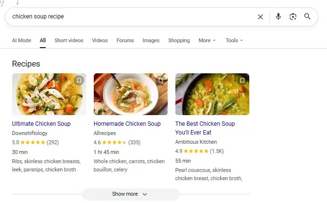
Schema markup is a form of structured data that tells search engines what your content means, not just what it says. It uses a standardized vocabulary from schema.org to label specific pieces of information, like an article’s author, a product’s price, or a recipe’s cooking time.
Here’s an example of the end result of some schema in action, showcasing added details for a recipe:
When you add schema to your HTML, it doesn’t change how your page looks to users, but it helps search engines interpret your content more accurately. That’s how you get things like star ratings, event dates, or FAQ dropdowns in SERPs.
Schema improves categorization by giving structure to information that would otherwise be unstructured or ambiguous. That extra clarity supports more precise indexing and increases your chances of appearing with rich results.
Most content online is considered unstructured data, which means it’s readable by humans but harder for machines to interpret. Schema adds structure that makes meaning explicit, bridging the gap between your content and how search engines understand it.
Types of Schema Markup
There are dozens of schema types, but only a handful consistently drive SEO value. The key is knowing which formats align with your goals and content structure. Here are the high-impact schema types you should focus on:
Commonly Used and SEO-Driven
Article: Use this for blog posts, news, or editorial content. It supports elements like headlines, bylines, and publication dates, helping your content stand out in organic results.
FAQ: Can make your page eligible for expandable Q&A boxes beneath your page title. A strong option for capturing more SERP space. FAQ schema works especially well on service or solution pages.
Product and Review: Must-haves for e-commerce. These display key details like price, availability, and customer ratings.
Local Business: Ideal for brick-and-mortar locations or service areas. It includes address, hours, contact info, and geo coordinates. Event: Showcases information for webinars, conferences, or in-person events like date, time, location, and ticket availability.
Breadcrumb: Enhances your site’s navigational trail in search results. It also helps search engines better understand your site’s structure.
Underutilized but High-Impact Schema Types
Video: Helps search engines surface and display videos with rich details like thumbnails, duration, and key moments.
Course: Designed for online education content. Includes fields for course name, description, provider, and learning outcomes.
Job Posting: If you’re listing open roles on your website, this schema can push them into Google Jobs with structured info like salary, qualifications, and deadlines.
Software Application: Highlights app features, pricing, platform compatibility, and reviews. Ideal for SaaS companies or digital products.
There are also industry-specific schema types for recipes, medical conditions, real estate listings, and more, each designed to help content stand out in competitive niches.
While most websites stick to just one or two schema types, combining them across relevant pages gives Google a clearer picture of your site and can increase eligibility for multiple rich result formats.
Why is Schema Markup Important For SEO?
Schema markup doesn’t directly impact rankings, but it can improve how your pages appear in search by making your content easier for search engines to understand. When used correctly, it clarifies the structure and intent behind your content, which improves how your pages appear in search results.
With SEO schema markup, your listings can include extra context like star ratings, pricing, or FAQs, making them more informative and more likely to be clicked when rich results appear. These enhanced listings improve visibility and help searchers understand your content before visiting your site, which supports better engagement and user satisfaction.
Structured data also improves the user experience by giving searchers helpful, structured details before they even land on your site. This kind of clarity reduces bounce rates and increases engagement, which are both positive behavioral signals.
To be clear, Google has stated that structured data is not a direct ranking factor. But it can improve how your content is understood and discovered in search.
“Structured data is not used for ranking purposes, but it can enable search result enhancements and content discovery.” — Google Search Central
If you’re not using schema markup yet, you’re likely leaving visibility and traffic on the table, especially in crowded search spaces.
Schema Markup And AI
As search shifts toward generative results, schema markup becomes increasingly valuable, not as a ranking signal, but as structured clarity that helps machines interpret content consistently at scale. Tools like Google’s AI overviews, ChatGPT, and other large language models increasingly reference or infer structured relationships in your content. While schema markup isn’t directly parsed by every AI tool, it provides a framework that reinforces meaning, credibility, and context.
In Google’s case, schema can increase the chances of being featured or cited in AI-generated summaries by making your content more machine-readable. Clear, structured data helps Google understand which parts of your content are most relevant to a query, and that’s exactly what fuels AI-powered result boxes.
It also supports consistency across platforms, ensuring that search engines, crawlers, and third-party tools are all interpreting your information the same way. That’s critical in a landscape where content can be surfaced in snippets, carousels, voice results, and generative interfaces.
As AI continues to reshape search behavior, structured data plays a critical role in making your content visible and machine-readable across evolving search experiences.
How to Create Schema Markup for SEO
There’s no single way to implement SEO schema markup. The right method depends on your setup, your tools, and how much control you want over the code.
Schema Markup Generators
Schema generators are great to help create your schema type so you don’t have to do it manually. They offer flexibility and control, especially if you want to create cleaner SEO schema markup using JSON-LD.
One great option is Dentsu’s Schema Markup Generator. It supports a wide range of schema types and gives you real-time previews of the structured data output.
Another user-friendly pick is Schema.dev, which offers a visual editor for common schema types like Article, Product, Event, and more. It’s great for marketers who want more polish without touching raw code.
If you’re working on technical SEO at scale, tools like RankRanger’s generator or the Hall Analysis tool can help automate more advanced schema needs.
Most of these tools will output JSON-LD code, which you can copy and paste directly into your website’s head tag or through a CMS plugin.
Build Schema Manually
For developers or SEOs who want full control, manually writing SEO schema markup in JSON-LD is the most flexible option. This approach is ideal when you need to nest data types, customize beyond what’s available in generators, or integrate schema into a templated CMS or headless setup.
The most common format for manual schema is JSON-LD, a lightweight data format that can be placed inside a <script type=”application/ld+json”> tag in your HTML.
Schema.org provides documentation and examples for hundreds of item types, including complex combinations like a Product with reviews, availability, and brand info.
While this method takes more effort, it allows you to fine-tune every field and ensure the markup perfectly matches your content structure.
If you’re confident in your technical skills or already working with structured templates, hand-coding schema can unlock the most advanced use cases.
Use WordPress Plugins
If your site runs on WordPress, adding SEO schema markup is straightforward with the right plugin, with no coding required.
Yoast SEO adds basic structured data out of the box, like Article, WebPage, and Organization schema. You can also set defaults for different post types or override schema per page.
Rank Math offers more flexibility with its built-in Schema Generator. It supports custom fields, nested schema, and additional types like Product, FAQ, and Course. You can add schema site-wide or build it block-by-block using their visual editor.
Another option is the Schema & Structured Data for WP plugin, which offers advanced rule-based schema placement, support for over 30 types, and WooCommerce integration.
Most plugins handle the technical output for you, just select the schema type, fill out the fields, and publish.
Use ChatGPT
ChatGPT is a quick way to generate SEO schema markup without relying on a plugin or tool. It’s especially useful when you want structured data for a specific content type but don’t want to hand-code it from scratch.
To get started, just ask ChatGPT for the schema you need. For example:
“Create JSON-LD schema markup for a Product with name, price, rating, and availability.”
You can also refine the output by adding more context. Want to include an author bio? Just ask. Need multiple FAQs? List them out, and ChatGPT can format them for you.
The results are typically in valid JSON-LD format and can be copied into your site’s HTML or CMS.
It’s not a replacement for technical SEO tools, but it’s a powerful shortcut when used with the right prompts.
Add Schema Markup to Your Site
Once you’ve created your SEO schema markup, you need to place it on your site where search engines can find it. The most common format is JSON-LD, which should be embedded inside a <script type=”application/ld+json”> tag.
If you’re working directly with code, add the schema to the <head> section of your page, or just before the closing </body> tag. This helps ensure it gets picked up by search crawlers.
If you’re using a CMS like WordPress, Shopify, or Wix, many themes or SEO plugins include fields where you can paste your structured data directly. Just copy your JSON-LD and drop it into the appropriate field.
As we mentioned before, plugin-based setups, tools like Rank Math or Yoast will often insert schema automatically based on your settings, with no manual copy-paste needed.
No matter the method, the goal is the same: get valid, clean schema markup live on your site.
Validate Your Schema
Before you publish any SEO schema markup, you need to validate it. Even small formatting issues can break how search engines read your structured data.
You can either paste in your raw JSON-LD code or enter the URL of a published page. The tool will scan your markup and return any errors, warnings, or unsupported types.
Look for a “Valid” result nd ensure the schema type you used is recognized and correctly implemented. If there are issues, revise your code and re-test until everything passes.
You can also use Google’s Rich Results Test to see if your schema is eligible for enhanced SERP features.
Validation is a small step that ensures your markup actually works and gets you the visibility you’re aiming for.
Best Practices For SEO Schema Markup
To get the most out of your SEO schema markup, you need more than valid code. These best practices help ensure your structured data drives real visibility while staying within Google’s guidelines.
Only mark up visible, relevant content:
Don’t tag hidden elements, placeholder content, or anything users can’t actually see.
Schema should reflect what’s on the page. Misleading or hidden markup can get ignored or flagged.
Use the most specific schema type available:
Avoid generic markup. If your content is a recipe, use Recipe schema. If it’s a course, use Course schema. The more specific and accurate, the better.
Keep your structured data up to date:
Prices, dates, product availability, and other time-sensitive data should reflect the live content. Inaccurate schema can confuse search engines and users.
Avoid over-marking or spamming schema types:
Just because a schema exists doesn’t mean it belongs on your page. Only mark up what’s directly relevant and helpful to the user.
Accurate, helpful schema increases your chances of showing up in enhanced results. Misused or sloppy markup reduces trust and visibility.nd not content in hidden div’s or other hidden page elements.”
FAQs
What is schema markup?
Schema markup is a type of structured data that helps search engines understand the meaning of your content. It uses a shared vocabulary defined by schema.org to label key details like titles, authors, ratings, and more. When implemented correctly, it makes your content eligible for rich results, enhanced listings that display extra information directly in search.
What is schema markup SEO?
Schema markup SEO refers to the use of structured data as part of your overall search optimization strategy. While it doesn’t directly impact rankings, schema enhances how your pages appear in the SERPs. By making content easier to interpret and display, it supports better visibility, higher click-through rates, and alignment with user intent.
Does schema markup help SEO?
Yes, but not in the way most people expect. Schema doesn’t give you a direct ranking boost, but it improves how your pages are presented in search. Rich results stand out more, offer better context to users, and tend to earn more clicks. Schema can improve visibility and click-through rates, which can help your content attract more traffic over time.
Conclusion
Schema markup is one of those SEO techniques that helps to improve how your content appears in search results, yet it’s still underused. It helps search engines understand your pages more clearly, which leads to richer results, better visibility, and more clicks.
Whether you’re optimizing blog content, product listings, or service pages, structured data gives your site a clearer presence in search, and that matters in competitive markets.?
User Experience (UX) optimization isn’t just a design choice. It’s a conversion strategy. If your site is confusing, slow, or frustrating to use, people bounce. They won’t dig for what they need. They’ll leave.
And most won’t come back. According to the Baymard Institute, 88% of online consumers are less likely to return to a site after a bad user experience.
Good UX removes friction. It helps users find what they need faster, trust your content, and stay long enough to convert. It also signals to Google that your site is useful, which improves rankings, engagement, and retention.
This guide breaks down the UX best practices that actually move the needle. No theory. Just clear, actionable ways to make your site easier to use and more effective at turning visitors into customers.
Key Takeaways
Effective user experience (UX) optimization starts with understanding your audience. Use data, heatmaps, and behavioral insights to design around real user needs, not assumptions.
Simplicity wins. Clean layouts, clear navigation, and fast-loading pages make it easy for visitors to engage and convert.
Mobile-first design is essential. With most users browsing on phones, responsive layouts and touch-friendly interfaces are critical to user satisfaction and search visibility.
Great UX directly improves conversions. Every element, from your CTA to your checkout, should guide visitors smoothly toward a goal without friction.
Testing never stops. Continuous A/B testing, analytics tracking, and user feedback loops keep your UX aligned with evolving expectations and business results.
Why User Experience Matters
User Experience (UX) optimization improves more than just aesthetics, directly affecting how well your website performs. A frustrating layout, slow load time, or confusing interface can increase bounce rates, reduce conversions, and damage brand credibility.
When visitors arrive, they’re deciding whether to stay or leave within seconds. If key elements are hard to find or the mobile experience falls short, you lose them.
Clear, intuitive design helps users find what they’re looking for and take the next step. That might mean reading more, subscribing, or completing a purchase. It’s also a core part of conversion rate optimization, where even small UX changes can lead to measurable gains. CRO and UX are areas that more and more marketers are devoting increased budgets to.
User experience also plays a role in how search engines evaluate your content. Signals like mobile usability, site structure, and page performance can influence your visibility, even if UX itself isn’t a ranking factor.
When you improve the way people experience your site, you improve nearly every performance metric that matters.
How UX Supports SEO
User experience and SEO share the same goal: helping people find what they need quickly and easily. SEO drives traffic, while UX keeps visitors engaged once they arrive.
Search engines now factor experience quality into rankings. Google’s Core Web Vitals evaluate how fast a page loads, how smoothly it responds, and how stable the layout feels as it renders. When pages perform well, users stay longer and bounce less, which signals quality to search engines.
Mobile usability plays a major role too. With mobile-first indexing, Google often ranks sites based on their mobile experience. A responsive design that works across all devices improves both accessibility and visibility.
Strong UX optimization helps your SEO work harder. The better your experience, the easier it is for users to explore, trust, and convert.
Next, we’ll break down the UX best practices that make those results possible.
UX Best Practices
The following UX best practices will help you design faster, simpler, and more effective experiences that keep users engaged from their first click to conversion.
Know Your Target Audience
Effective UX optimization starts with understanding who your users are and what they expect from your site. When you base design decisions on real data instead of assumptions, you can create experiences that feel natural, relevant, and easy to use.
Collect audience insights through analytics, user surveys, and behavior tracking. Build personas that capture motivations, preferences, and pain points. These details help you personalize the experience, from navigation to recommendations, in ways that feel helpful, not forced.
Personalization is a proven factor in increasing conversions, so it makes a good starting point for your UX improvements:
Thrive Market is a strong example of user understanding in action. The healthy food retailer tailors its shopping experience through an onboarding quiz that asks about dietary needs and personal goals. Shoppers receive customized product recommendations and grocery lists that match their answers, which removes friction and builds trust from the first visit.
When you design around what your audience values most, engagement becomes effortless. The next step is to make that experience as simple as possible.
Keep Things Simple
Simplicity is one of the most powerful UX best practices. Users form an opinion about your site in seconds. Cluttered layouts and confusing navigation create friction. A clean, structured interface helps visitors find what they need quickly and trust what they see.
Research shows that 88 percent of users are less likely to return after a bad experience. Simplicity isn’t just a design preference. It’s how you keep people on your site and build trust with every interaction.
Apple’s website remains one of the clearest examples of simple, effective design. The layout uses generous white space, clean typography, and bold product visuals that highlight what matters most. Each page features short, direct copy and clear calls to action such as “Learn more” or “Buy.” This approach keeps attention focused and makes navigation effortless.
Simple design improves accessibility and reduces cognitive load. It helps users stay oriented and confident as they explore. Once your site feels easy to use, the next step is making sure it performs the same way on every device.
Build Around Mobile
Mobile traffic now dominates the web, and most users expect sites to work perfectly ontheir phones. If your layout isn’t responsive, you’re losing potential customers before they ever see your content.
Mobile UX design focuses on speed, clarity, and easy navigation. Pages should load fast, text should be readable without zooming, and buttons should be large enough to tap comfortably. A smooth mobile experience keeps users engaged and signals quality to search engines under Google’s mobile-first indexing. It also helps with cart abandonment.
Starbucks offers a strong example of mobile-friendly UX in action. Its responsive design adapts across screens, and the app’s ordering system is simple enough to use one-handed. Customers can browse, order, and pay in seconds, which builds loyalty through convenience.
Mobile UX optimization improves both experience and performance. When users can navigate easily, they stay longer and convert more often. Next, we’ll look at how to guide those users toward the actions that matter most.
Set Goals and Guide Users There
Every great UX design starts with a clear goal. Users should always know what to do next, and every part of your layout should make that path obvious. When visitors understand your purpose, they’re more likely to take action and complete the journey you’ve built for them.
Strong UX optimization is goal-driven. Each page should serve a specific purpose, whether it’s capturing a lead, driving a purchase, or encouraging engagement through smaller actions such as watching a video or subscribing to a newsletter. These soft goals build trust and move users closer to conversion.
Dropbox demonstrates this principle with focus and simplicity. Its homepage centers around a bold, high-contrast “Try Dropbox Free” call to action button that stands out from surrounding content. The message is clear, the design uncluttered, and the action frictionless. This clarity of direction keeps users moving toward sign-up without confusion or distraction.
When your site guides users naturally, you reduce hesitation and increase conversions. The next step is to make sure that experience loads fast enough to keep them there.
Focus on Loading Speed
Speed is one of the simplest ways to improve UX optimization. A slow site frustrates users, hurts engagement, and damages your search visibility.
Fast-loading pages make your entire experience feel smoother and more trustworthy. They also reduce bounce rates and improve rankings because search engines use page performance as a quality signal.
There are practical ways to keep your site fast. Compress images, enable browser caching, and minimize heavy scripts or animations. Consider using a content delivery network (CDN) to distribute resources more efficiently.
When users can access your site instantly, they’re more likely to explore and convert. The next step is making sure that navigation keeps those visitors moving in the right direction.
Use Clear Navigation
Navigation is one of the simplest ways to improve UX. Visitors should be able to find what they need without stopping to think about where to click next. When users can move through your site effortlessly, they stay longer and engage more.
A common rule of thumb is that users should reach any key content within three clicks. While it’s not a strict requirement, the idea still holds: fewer steps mean less frustration and more conversions.
Best Buy demonstrates this principle with effective breadcrumb navigation and well-structured menus. Each category flows naturally into the next, making it easy for shoppers to explore products without getting lost. Clear labels, consistent placement, and visible CTAs reduce confusion and build confidence as users browse.
Good navigation creates momentum. It guides users from curiosity to action and supports the next layer of UX design, establishing a strong visual hierarchy.
Design Hierarchy
Design hierarchy gives structure to your website and helps users focus on what matters most. It’s the principle of using layout, size, color, and placement to show importance and guide attention. When your visual elements follow a clear order, users can navigate your content naturally and confidently.
People don’t read web pages from top to bottom. They scan. Good design aligns with that behavior using visual cues to lead the eye in a predictable flow. Larger fonts, contrasting colors, and prominent placement signal priority and make it easier for visitors to decide what to do next.
Netflix provides a great example of design hierarchy done right. The homepage features bold hero images, clear typography, and obvious CTAs like “Play” and “More Info.” Each element has a specific purpose, guiding users from interest to action without confusion.
Strong hierarchy keeps your design accessible, clear, and easy to use. The next step is to make sure every user can experience it the same way.
Make it Accessible
Accessibility is a core part of UX optimization. Every visitor should be able to navigate, understand, and interact with your site, no matter their abilities or the device they use. When your design works for everyone, you build trust and expand your audience.
Good accessibility starts with simple design choices. Use high-contrast colors for readability, add alt text to images, and make sure every function on your site can be accessed by keyboard. Provide captions for videos and use clear, descriptive link text so screen readers can interpret your content accurately.
Accessibility also includes transparency. Make privacy settings and cookie preferences easy to find and understand. When users know how their data is handled, they feel safer engaging with your content.
Collective Thoughts provides a strong example of accessibility done right. Each article includes an easy-to-find audio version, giving users multiple ways to engage with the same content.
For official standards, review the Web Content Accessibility Guidelines (WCAG). Accessible design benefits every visitor and keeps your site usable across devices, which is especially important for complex actions like forms and checkouts.
Streamline Forms and Checkouts
Checkout friction is one of the biggest UX killers in e-commerce. Every extra click, field, or delay gives users a reason to leave. According to the Baymard Institute, the average cart abandonment rate is nearly 70 percent.
Simple, efficient forms create a faster path to conversion. Ask only for essential information, and make sure labels are clear. Use autofill and progress indicators so users always know where they are in the process. Guest checkout options and flexible payment methods such as PayPal, Apple Pay, and Google Pay remove unnecessary steps that slow people down.
Amazon set the standard for streamlined checkout. Returning users can buy instantly using saved details, skipping the typical multi-step process. That speed and convenience are why the feature became a benchmark for great UX optimization.
When the path to purchase feels effortless, conversion rates rise. The same principle applies to browsing, users should be able to find what they want just as easily.
Use Product Filters and Site Search
Filters and search tools are essential to strong UX optimization. When users can find what they need quickly, they’re more likely to stay, explore, and buy. On large e-commerce sites, well-designed filters reduce decision fatigue and keep the experience organized.
Zappos is a standout example. Its product pages let shoppers filter by size, color, price range, and brand, all from a clean, intuitive sidebar. The site also uses smart search that suggests relevant products as you type, saving time and minimizing frustration. Every interaction feels smooth because the structure matches the way people actually shop.
Good UX best practices make discovery easy. Use predictive search, logical categories, and visual cues like color swatches to help users narrow results faster. When navigation feels effortless, users feel in control, and that control leads to more confident conversions.
The next step is communicating what happens after each click so users always know what to expect.
Test, Test, and Test Again
UX optimization is never finished. Designs that work today can feel outdated or confusing tomorrow. Regular testing keeps your experience aligned with real user behavior instead of assumptions.
Start by using analytics to identify where users drop off or hesitate. Tools like Google Analytics and ContentSquare reveal how people scroll, click, and move through your site. Session recordings and heatmaps show which elements attract attention and which ones get ignored.
A/B testing takes it further. Platforms such as Optimizely or VWO let you compare two versions of a page to see which performs better. Even small adjustments to headlines, layouts, or CTAs can have measurable impact.
The goal is consistent improvement. By testing, analyzing, and iterating regularly, you build a user experience that gets stronger with every insight. Next, we’ll look at how to measure that progress through key UX metrics.
Track Key Metrics for UX Success
Great UX is measurable. Tracking the right data shows whether your optimizations are actually improving the experience. Without clear metrics, you’re just guessing at what works.
Start with the fundamentals. Bounce rate tells you if visitors find your content relevant. Engagement rate shows how long they stay and how deeply they interact. Conversion rate reveals how effectively your UX supports business goals. Together, these numbers tell the story of your site’s performance.
Core Web Vitals are equally important. They measure loading speed, interactivity, and visual stability, the technical foundations of user experience. Improving these signals helps both users and search engines trust your site.
Be sure to monitor these metrics regularly. When you track, analyze, and act on the data, your UX gets sharper and more effective over time. That ongoing improvement is what separates good experiences from great ones.
FAQs
What is user experience?
User experience (UX) is how someone feels when interacting with your website, app, or product. It includes everything from design and navigation to speed and usability. Good UX helps people find what they need quickly and enjoy the process, which builds trust and increases conversions.
What is UX optimization?
UX optimization means improving your site’s design, structure, and performance to make it easier and more enjoyable to use. It focuses on removing friction, improving speed, and guiding users toward clear goals. The result is higher engagement and stronger business results.
What are UX best practices?
UX best practices are proven methods for creating a smooth, intuitive digital experience. They include understanding your audience, simplifying design, using clear navigation, optimizing for mobile, improving accessibility, and testing regularly. These principles make your site more usable and trustworthy.
How do UX best practices impact SEO?
UX best practices directly affect SEO performance. Search engines reward sites that load quickly, work well on mobile, and provide a smooth, intuitive experience. While metrics like time on page or bounce rate aren’t direct ranking factors, strong UX helps users find what they need, stay engaged and complete tasks, which all contribute to better overall performance.
How can I improve website UX?
Start by analyzing how users interact with your site. Simplify your layout, improve page speed, and test your navigation flow. Use clear CTAs and make sure your content is accessible and easy to read.
What tools can I use to test my UX design?
Tools like Google Analytics and ContentSquare help you see where users click, scroll, and drop off. You can also run A/B tests with Optimizely or VWO to compare layouts and features. User feedback platforms such as UserTesting provide direct insights from real visitors.
What is mobile UX design?
Mobile UX design ensures your website works seamlessly on phones and tablets. It includes responsive layouts, readable text, quick load times, and tap-friendly buttons. Strong mobile UX improves accessibility, reduces bounce rates, and helps your site perform better in mobile search results.
Conclusion
Implementing these UX best practices can dramatically improve the user’s journey across your site, increase conversions, and elevate your brand reputation.
Remember, understanding your audience is extremely important. Everything you design should be with your users in mind. Keep things simple, prioritize accessibility, don’t forget about mobile, and never stop testing and refining.
Get started today by examining your site’s user experience and identifying areas for improvement. It may be time to revisit your mobile optimization. Or do your forms need streamlining for a smoother checkout process?
Every change you make can potentially improve your users’ experience and, by extension, your bottom line.
http://dubadosolutions.com/wp-content/uploads/2017/05/dubado-logo-1.png00http://dubadosolutions.com/wp-content/uploads/2017/05/dubado-logo-1.png2025-11-26 20:00:002025-11-26 20:00:00UX Optimization Best Practices to Improve User Experience
Forty-six percent of all Google searches have local intent. That means nearly half the time someone types something into the search bar, they’re looking for something nearby, like a dentist or a plumber.
If your business isn’t showing up in those results, you’re losing easy wins. That’s where local SEO citations come in. These are the digital breadcrumbs that help search engines (and customers) find and trust your business.
Citations aren’t just for maps and directories anymore. With the rise of AI Overviews and platforms like ChatGPT and Perplexity pulling from trusted sources, having accurate, widespread citations can increase your visibility across all forms of search.
In this post, I’ll break down what local citations are, why they matter more than ever, and how to build them the right way, without wasting time on low-value directories.
Key Takeaways
Local SEO citations are online mentions of your business’s name, address, and phone number (NAP).
Citations help search engines verify your business is real and improve your visibility in local search results.
Accurate, consistent citations across trusted platforms build authority and trust for both search engines and users.
AI tools like ChatGPT and Google’s AI Overviews often surface citation sources, making them more important than ever.
The best strategy focuses on quality over quantity. Start with high-authority directories and expand into niche platforms.
Tools like BrightLocal, Whitespark, and Semrush can help automate citation building and cleanup.
What Are Local Citations?
Local SEO citations are online mentions of your business’s name, address, and phone number, commonly known as NAP. You’ll usually see these on business directories, review sites, apps, maps, and social platforms.
These citations act as digital trust signals. When they’re consistent and accurate across multiple platforms, search engines see your business as more reliable, which can improve your visibility in local search results.
As an added note, AI tools like ChatGPT, Perplexity, and even Google’s own AI Overviews increasingly rely on structured business data from trusted citation sources.
You can create citations manually or through tools (more on that soon), but either way, you need to keep them updated and consistent across all listings.
Local Citation Types
There are two broad categories of citations: general or core platforms and industry-specific directories. Both serve a purpose. The key is knowing which ones your audience actually uses.
Google Business Profile is one of the most important citation sources. Complete your profile with hours, categories, photos, and reviews. It directly feeds into Google Maps and local pack rankings, making it a must-have.
Yelp is another top-tier directory. A well-optimized listing here adds authority and may drive referral traffic.
Bing Places for Business works similarly to Google’s platform and is still worth claiming, especially if your audience includes older users or anyone in corporate environments where Bing is the default search engine.
Facebook Business Pages double as citations and engagement hubs. They show up in search and allow customer interaction.
Apple Business Connect is important because Siri and Apple Maps pulls this information.
Niche platforms like OpenTable (restaurants), Avvo (legal), Zocdoc (medical), or TripAdvisor (travel) carry extra weight in their verticals and often convert better.
Local chambers of commerce, review platforms like Trustpilot, and neighborhood networks like Nextdoor also count as valuable citations when relevant.
How Local Citations Help SEO
Local citations do more than just increase visibility. They build trust and help search engines connect the dots between your business and the communities you serve. That’s foundational for strong local search marketing.
While exact percentages tied to citation impact aren’t publicly available for 2024, multiple sources still cite NAP consistency and citation volume as foundational local ranking factors. For example, SOCi reports that 80 percent of U.S. consumers search for a local business online at least weekly, and if your listings aren’t showing up accurately, you’re not in the running.
Citations also support E-E-A-T (experience, expertise, authority, trust), all key signals Google looks for when ranking local results.
A good starting point is generally 30 to 50 accurate, high-quality citations to build a strong foundation and establish a baseline. Depending on your industry and market size, you may need more.
Even one inaccurate listing can hurt trust and confuse Google’s local algorithms.
Local Citations and LLM Presence
Platforms like Google’s AI Overviews and large language models (LLMs) like ChatGPT, and Perplexity pull data from structured, verified sources. That means your business listings on sites like Google Business Profile, Yelp, Bing Places, and TripAdvisor may be referenced automatically, if the information is accurate and consistent. See the example below from ChatGPT:
Even addresses can pop up in the results if they are online for the tools to pull.
LLMs don’t crawl the web like Googlebot, but they rely heavily on trustworthy, indexed data. A clean citation profile gives your business a better shot at showing up in AI summaries, especially for local service queries.
If your listings are messy or missing key info, you risk being ignored altogether, even if you rank well in traditional search.
This is where citation building becomes a proactive strategy, not just a foundational one.
What is Local Citation Building?
SEO citation building is the process of actively creating and maintaining listings for your business across third-party sites, like directories, maps, review platforms, and social networks.
Think of it like digital plumbing. You’re creating multiple, consistent “pipes” that point back to your business, and every new, accurate citation helps search engines and AI tools understand who you are and where you operate.
Let’s say you run a boutique gym in Chicago. Citation building would involve creating or updating your listings on Google Business Profile, Yelp, Bing Places, Apple Maps, and niche platforms like ClassPass or Mindbody.
It’s not a one-and-done task. Building citations takes ongoing effort, especially if you move locations, change your phone number, or expand services.
Most businesses use citation-building tools to scale this process and stay organized. That’s what we’ll cover next.
Local Citation Building Platforms
SEO citation building can be time-consuming if you’re doing everything manually. That’s why many marketers rely on specialized tools to create, audit, and manage citations at scale.
Here are three platforms that can help simplify the process.
BrightLocal
BrightLocal is an all-in-one platform for managing local SEO. It includes tools for citation building, auditing, and cleanup.
You can submit your business info to 100+ general and niche directories, fix inconsistent listings, and remove duplicates, all from one dashboard. It also tracks your citation status over time, so you can see what’s live, pending, or missing.
One standout feature is its ability to prioritize directories based on your industry and location, helping you focus on what actually moves the needle.
Pricing starts at $39/month, with individual citation submissions available from $2 per site.
WhiteSpark
Whitespark is best known for its Local Citation Finder, a tool that helps you discover where your competitors are listed and where your business is missing out.
You can run audits, track your existing citations, and build new ones through customized campaigns. The platform also includes tools for citation tracking, reporting, and outreach.
Whitespark offers both DIY tools and fully managed services, making it flexible depending on how hands-on you want to be.
A free version of the Citation Finder gives you basic data on one campaign. Paid plans start at $39/month, with custom citation-building services priced separately.
Semrush Listing Management
Semrush Listing Management helps you distribute and manage your business info across key directories from a single dashboard. You can update your name, address, phone number, and other details in one place, and it syncs across dozens of platforms.
The tool also flags issues like duplicate listings or inconsistent NAP data, so you can fix errors that hurt your local SEO. You can monitor your presence on Google, Yelp, Apple Maps, and other places, while tracking how visibility changes over time.
A free scan gives you a snapshot of your current listings. Full access starts at $20/month per location.
Best Practices For Local Citation Building
Citation building isn’t hard, but doing it well takes attention to detail and long-term consistency.
Start by auditing your current listings. Tools like Moz or BrightLocal can help you identify missing profiles, duplicates, or inconsistent details. Then, focus on the most visible platforms: Google Business Profile, Yelp, Bing Places, Facebook, and Apple Business Connect are great starting points.
Claim and complete your profiles. Don’t stop at NAP. Fill in everything you can, including a business description, website URL, product or service categories, attributes, hours, holiday hours, service areas, and anything else that gives customers and algorithms more context. Additionally, add high-quality photos to show customers your location, products, or services.
Be obsessive about consistency. Even small discrepancies like “St.” vs. “Street” can confuse search engines. Keep your NAP exactly the same across every platform.
If you’re managing listings at scale, look for platforms that offer API access or bulk editing tools. It’ll save hours of manual work.
Build a tracking system to regularly check and re-verify your listings. Businesses move, hours change, and platforms update their guidelines, things can fall out of sync fast.
Finally, take cues from your competitors. If they’re ranking in the map pack and listed on a directory you’re missing, that’s a signal. Focus on quality over quantity, and prioritize directories relevant to your niche.
And don’t forget to support your citation strategy with strong local link building. The two go hand-in-hand when it comes to building local authority.
FAQs
What is local citation building?
Local citation building means creating and maintaining business listings across third-party platforms like Google, Yelp, and Facebook. These listings include your name, address, phone number (NAP), and other key details. Accurate, consistent citations help search engines validate your business and improve your local SEO.
What are local SEO citations?
Local SEO citations are online references to your business’s name, address, and phone number, even if there’s no link. You’ll usually find them on directories, review sites, apps, or social platforms. When these citations are consistent and appear on trusted sites, they improve your visibility and authority in local search.
How do local citations help SEO?
Citations tell search engines that your business is real, active, and relevant to a specific location. They also reinforce your trust signals and support local ranking factors like E-E-A-T (experience, expertise, authority, trust). Inconsistent or missing citations can lower your chances of showing up in map results or AI-generated summaries.
How does citation building impact a business’s online visibility and local search rankings?
The more accurate citations you have across trusted sources, the easier it is for search engines to connect your business to relevant searches. Citation building improves your local rankings, boosts discovery in maps and directories, and increases your credibility with searchers.
How to build local citations?
Start by auditing your existing listings with a tool like BrightLocal or Semrush. Then, claim and complete your profiles on top directories like Google Business Profile, Yelp, and Bing Places. For more tips, check the best practices section above.
What is NAP consistency?
NAP stands for name, address, and phone number. NAP consistency means keeping those details exactly the same across every platform. Even small mismatches can confuse search engines and hurt your rankings. Consistent NAP is also critical for voice search, map listings, and AI-generated search summaries.
Conclusion
Citation building is still one of the simplest and most reliable ways to improve your local visibility, especially with AI and LLMs reshaping how local results are delivered.
You don’t need to be on every directory. Focus on quality platforms, stay consistent, and treat your listings as an extension of your brand. Even a small number of trusted citations can make a measurable difference in your rankings.
If you’re managing listings across multiple locations or just don’t have time to keep things updated, working with alocal SEO agency can take the heavy lifting off your plate. They’ll help you scale your strategy while avoiding common pitfalls.
http://dubadosolutions.com/wp-content/uploads/2017/05/dubado-logo-1.png00http://dubadosolutions.com/wp-content/uploads/2017/05/dubado-logo-1.png2025-11-25 20:00:002025-11-25 20:00:00Local SEO Citations: What They Are & How to Use Them
Instagram remains one of the most powerful platforms for growing a brand online.
With more than 2billion active users, Instagram marketing has long been a must if you’re in fashion, beauty, fitness, food, travel, or ecommerce. But it’s not just for visual-first industries anymore. Service businesses and B2B brands are winning here, too.
The catch? You can’t just post and hope for the best. To succeed on Instagram, you need to post the right content to stay relevant to current followers while bringing in new ones.
To grow, you need a smart content strategy and an understanding of how the algorithm works.
This guide will walk you through proven Instagram marketing tips to help you attract followers and drive engagement.
Key Takeaways
Instagram marketing works best when it’s intentional. Know your audience, post with purpose, and build content that connects rather than just fills a feed.
Consistency beats frequency. Three to five quality posts a week, backed by Reels and Stories, is often enough to stay visible and relevant.
Short-form video drives discovery. Reels and Stories remain the fastest way to reach new audiences and spark engagement.
Engagement fuels the algorithm. Comments, saves, and shares can carry more weight than likes, so encourage interaction and conversation.
Authenticity wins. From influencer partnerships to user-generated content, real voices and experiences build more trust than polished ads.
What Is Instagram Marketing?
Instagram marketing uses the platform’s creative tools and community reach to help brands build genuine connections and grow their business. At its best, it blends storytelling with strategy, with visuals to pull people in and a message that keeps them interested.
That 1-2 punch should be present in everything from organic posts and Stories to paid ads, influencer partnerships, product tagging, and more.
The payoff can be tremendous. After all, many of Instagram’s 2 billion users actually want to connect with businesses. More than 60 percent of those on Instagram use the platform to follow or research brands and products.
This makes Instagram a top channel for building brand awareness and showing off your products. It’s a platform for building real relationships with your audience.
You just need to know how to use it the right way.
Why Should Marketers Care About Instagram?
Instagram is now as much a discovery engine as it is a visual app.
Its audience spans every major demographic. Nearly 30 percent of users are 18 to 24, almost 32 percent are between 25 and 34, and engagement among users over 35 continues to grow.
In other words, your customers are already scrolling here.
And many search for products and recommendations directly in-app. That mix of scale and buyer intent makes it one of the best social platforms for brand awareness and conversions alike.
But there’s a bigger reason marketers should care: Search is changing.
AI-powered search models like Google’s AI Overviews and ChatGPT are increasingly pulling content from social platforms like Instagram to understand what’s relevant and credible. That means your brand’s Instagram presence can also strengthen your broader SEO and “search everywhere” strategy.
Even if you’re not ready to run full campaigns, Instagram gives you real-time feedback on what resonates. Watch how your audience engages, and use those insights to shape smarter content across every channel.
Unique Instagram Features for Marketing
Instagram gives marketers a full toolbox, and knowing which tool to use can make all the difference.
Posts are your foundation. They’re where your brand identity lives. Think of them as the grid that tells your story at a glance. Static images, carousels, and graphics still perform well when they’re cohesive and recognizable. Think of your feed as your brand’s first impression.
Stories add the real-time connection. They disappear after 24 hours (unless added as a highlight) but consistently drive some of the highest engagement on the platform. Brands use them for behind-the-scenes content, polls, quick updates, or product drops. These types of content feel personal and urgent.
Reels are Instagram’s growth engine. Short-form video gets prioritized in the algorithm and can extend your reach far beyond followers. Brands like Gymshark and Duolingo use Reels to blend education, entertainment, and personality into discoverable content that quickly builds awareness.
Livestreams are about interaction. They let you talk directly to your audience, host Q&As, or spotlight a new launch. The immediacy builds trust in a way that pre-edited content can’t.
Instagram Shop turns discovery into purchase. With product tags, collections, and integrated checkout, followers can go from seeing your post to buying in seconds.
Used together, these features create a seamless customer journey: discover, engage, convert.
How to Get Your Brand Started on Instagram
This may all sound great in theory, but how do you actually start marketing your brand on Instagram? We’ve got you covered.
Zero In on Your Target Audience on Instagram
Before you post anything, get crystal clear on who you want to reach with your Instagram marketing strategy (and why you’re on the platform in the first place). A more focused audience makes everything else easier, from your content strategy and captions to your hashtags and ad targeting.
Start by defining your ideal customer: age, interests, behaviors, and what kind of content grabs their attention. Then look at where your brand overlaps with that.
For example, Nike Running focuses on athletes chasing progress.
Glossier, on the other hand, speaks directly to beauty fans who love minimal, real-life aesthetics.
Both Nike and Glossier know exactly who they’re talking to, and it shows in everything they post.
When you understand your audience, you create relevance. And that’s the foundation of every successful Instagram marketing strategy.
Optimize Your Instagram Profile
Your Instagram profile is your brand’s first impression.
A complete, well-structured profile is a little like a digital business card. It helps followers (and Instagram’s algorithm) understand who you are and why you’re worth following.
Start by switching to a Business or Creator account. It unlocks analytics, contact buttons, and access to Meta’s ad tools. You’re going to need all that if you want to grow strategically.
Then, fill out every available field. Add your profile photo (ideally a recognizable logo or product image), and write a bio that clearly communicates what your brand offers and who it’s for. Short, specific, and benefit-driven wins every time.
You’ll also want to make sure to include:
Contact information: Include your physical address, email address, and phone number so followers can contact you directly. When you include this contact information, Instagram automatically builds related buttons (Call, Get Directions, Email).
Category or categories: These groupings appear as circular topics under your name and are a simple way to showcase what your brand is about. Check out our page to see how we do it.
Call-to-action buttons: You can tailor your buttons to your business offerings (like Book Now or Order Food) to allow visitors to take specific actions, like making an appointment or booking a reservation. To incorporate these buttons into your profile, select Edit profile and tap Action buttons.
Don’t skip the category tag under your name, either. It instantly tells visitors what industry you’re in. And if you have multiple offerings, use Story Highlights to organize them into quick-reference guides for new followers.
A complete profile signals professionalism, boosting the odds your content reaches the right audience.
Do Some Starter Keyword Research
You might associate keyword research mostly with Google, but it’s the foundation of visibility for Instagram marketing, too.
While the platform is built on visuals, discovery still happens through words—in captions, hashtags, and even alt text. That’s how Instagram decides what content to show in search and suggested feeds.
Start simple: Type topics related to your brand into the Instagram search bar.
The auto-suggestions you see? Those are real queries your audience is making right now. Take note of recurring terms and relevant hashtags with active engagement.
Getting a sense for the language your audience uses and weaving it naturally into your posts is how you win. You’ll show up in more searches and connect with people looking for what you offer.
Start Posting High-Quality Content
What you post (particularly how it looks) and how often you show up matter just as much as what you say.
On Instagram, your visual identity is your brand voice. Keep the colors you use, the tone of your images, and your captions consistent. Your feed is basically a digital storefront. Every post should look like it belongs there.
Color psychology still plays a major role. Specific colors trigger an emotional reaction in the viewer. When selecting a color palette for your Instagram posts, choose hues that embody your brand’s identity and message.
Drybar, for example, uses a consistent yellow-accent theme across posts, reinforcing brand identity with visual consistency.
Next, experiment with formats.
Standard image posts build brand identity, while Reels boost reach. Stories help you stay top of mind with daily updates, and carousels are great for educational or step-by-step content.
Your goal isn’t necessarily to use every format. It’s more important to focus on the ones that fit your brand’s style and message.
Then there’s timing. Consistency often beats volume. A predictable cadence (say, three to five posts per week) trains both the algorithm and your audience to expect you.
Finally, use hashtags and keywords strategically. Three to five specific, niche hashtags usually outperform generic ones.
The same goes for captions. Natural language that your audience would search for is the way to go. Don’t get too wrapped up in buzzwords.
Remember: Every post reinforces who you are and why you matter to your audience.
Engage With Followers
Everyone wants to be heard, and your Instagram followers are no different. So, ensure they know you hear and appreciate them by liking their posts and replying to their comments.
Every comment, message, and tag is an opportunity to build trust. And trust fuels growth on Instagram.
Start by responding to comments and DMs quickly. It shows your audience there’s a real person behind the brand. You can also use interactive features like polls, Q&As, and emoji sliders in Stories to invite two-way conversations.
Reply to comments on your Reels, reshare user-generated content (UGC), and tag followers or partners when it fits naturally.
Brands like Supergoop and Alo Yoga do this well. They answer questions in comments, repost community photos, and encourage followers to tag friends who’d love the product.
Today, engagement is as much about connection as it is visibility. The more you show up for your audience, the more likely they are to engage and keep you in their feed.
Track Your Analytics
Instagram has some pretty comprehensive analytics that lets you gain both a bird’s-eye view of your performance and a granular view.
Start with Instagram Insights, available for all Business and Creator accounts. You’ll see metrics like reach, impressions, profile visits, and website clicks. These tell you how far your content travels and how effectively your Instagram marketing efforts drive action.
Reach and Impressions: Show how many unique users saw your content and how often. A spike can signal that a post hit the right tone or format.
Engagement: Likes, comments, shares, saves, and Reels interactions show what truly resonates. Saves, in particular, are a sign of high-value content.
Conversions: Use UTM links or Meta Business Suite to track traffic, leads, and sales coming from your Instagram content or ads.
For deeper analysis, tools like Sprout Social, Later, or Hootsuite give you expanded reporting and trend tracking over time.
Don’t just collect data for the sake of collecting it. Put it to good use.
If a certain post drives unusually high engagement, study the caption, image style, or timing. Apply those insights to your next batch of content.
Tracking consistently turns your strategy from guesswork into a growth engine.
Top Tips for Instagram Marketing
With billions of active users, Instagram is a major platform for businesses to market their products and services. However, it can be challenging to stand out from the crowd with so many brands vying for attention.
If you need help getting started, here are our top tips for marketing on Instagram.
1. Run Competitive Research
Even if you’re not currently using Instagram marketing as a strategy, your competitors most likely are.
Start by identifying three to five brands in your niche with active accounts and solid engagement.
Look at what and how often they’re posting and which formats (Reels, carousels, Stories) get the most traction. Notice the tone of their captions, how they respond to comments, and what hashtags they consistently use.
Tools like Sprout Social, Later, or even Instagram’s built-in dashboard can help you track competitor activity and spot trends over time.
2. Post Product Teasers That Will (Gently) Urge People to Buy
What if you could sell more products by posting product teasers on Instagram?
Well, you can.
Instagram is a great place to advertise your products. And if you play your cards right, you won’t annoy or scare users off with advertisements.
The trick is subtlety.
If you’re too pushy, followers will drop like flies. However, product teaser posts are a simple way to spark curiosity without looking like you’re trying too hard.
This works in almost any industry. For example, Starbucks teases its audience by promoting seasonal drinks with sharp imagery without trying to force people to buy them.
When you tease products people are interested in and don’t push them into buying anything, they’ll be more likely to pull the trigger and buy something.
If not, they might at least engage with your post by liking it, commenting on it, or sharing it with a friend.
A good product teaser shows just enough to make people want more. Use strong visuals or behind-the-scenes clips to highlight what makes your product unique without spelling everything out.
So, don’t be afraid to show off the goods by posting product photos. Just do it gently.
3. Practice Instagram SEO to Optimize Your Posts
Instagram has quietly become a search engine of its own. Besides scrolling, people search for content, products, and creators using keywords, hashtags, and topics.
Start by weaving the keywords you found earlier into your captions, alt text, and on-screen text in Reels. Instagram now indexes these areas, which means using natural, descriptive language helps your content show up in relevant searches.
Your username, display name, and bio also play a role. Make sure they clearly reflect your brand and niche. For example, “@JessiesVeganBakery” will always outrank “@JVBakes” for a user searching “vegan bakery.”
Avoid keyword stuffing, but do post with intent. If your audience can search it, say it.
4. Create Sponsored Ads
Instagram ads give brands the reach and precision targeting to get in front of exactly the right audience, even if they don’t follow you yet.
Using Ads Manager, you can run campaigns across feed posts, Reels, and Stories, each tailored to different goals like awareness, traffic, or conversions. Reel ads in particular perform well right now, thanks to high engagement and seamless integration into organic content.
You can start small by boosting your top-performing posts to test which visuals and messages resonate most.
Once you see what works, scale those efforts with targeted campaigns using custom or lookalike audiences.
Focus on clean visuals, short captions, and strong calls to action that feel natural in the feed.
And don’t forget your analytics. Performance data from your ads is a goldmine for refining your content and organic strategy.
Reels help you get discovered. They’re Instagram’s most visible format, with strong algorithmic push and viral potential. Use them in your Instagram marketing strategy to educate, entertain, or inspire. Quick how-tos, behind-the-scenes clips, or shareable tips work especially well.
Stories keep your audience close. They disappear fast, which makes them perfect for time-sensitive content like product launches, polls, or limited-time offers.
The key to success is consistency and repurposing. A single short video can live as a Reel, a Story, a YouTube Short, and even a LinkedIn post.
Keep videos under 30 seconds, add captions for sound-off viewing, and use on-screen text or stickers to guide attention.
6. Partner With Influencers for a Wider Reach
The fastest way to reach potential customers on Instagram is through influencers who already have a large following.
Many people will buy services or products based on what they see in their feeds from the influential people they follow. They trust them.
You don’t need a celebrity or a million followers to make an impact. Nano- or micro-influencers (creators with smaller but more engaged audiences), for example, can be effective because their recommendations feel personal and real.
For instance, La Croix runs campaigns with micro-influencers who post genuine lifestyle content using their product. These smaller creators drive engaged, niche audiences.
The first step is identifying a few influencers with an audience relevant to your product or service. Look for creators who genuinely align with your brand values and audience.
Study how they engage. Are followers commenting, saving, and sharing? That’s the kind of credibility you want to borrow.
Once you’ve found a match, build a relationship, not a one-off post. Offer creative freedom so influencers can present your product in their own voice. That authenticity performs better than scripted ads.
7. Come Up With an Interactive Branded Hashtag
If you want instant engagement, interactive hashtags are a great way to get it.
Customers can then use the tag to post user-generated content. This allows users to search through all posts relating to your brand.
It also lets you easily search through images you might want to consider reposting on your page.
Creating a hashtag that your company (and other users) can search for is essentially free advertising.
Whenever someone posts a photo using the tag, they expose your company to their followers.
Campaigns like #ShotOniPhone (Apple), which has netted more than 31 million posts, show how branded hashtags can extend far beyond a single promotion.
They create recognition and give fans a sense of belonging.
8. Post at The Right Times (and Don’t Over-Post)
Posting at the right time on Instagram matters. However, over-posting is a surefire way to turn off your existing followers.
If all they see is your brand on their news feed, they will probably unfollow you as fast as possible.
However, you want to post consistently to stay in their news feed regularly. One of the best ways to do this is to only post during peak days and hours when your followers are online.
Recent studies from Later and Sprout Social all point to a similar pattern: Engagement peaks mid-morning to early afternoon, Tuesday through Thursday.
Specifically, Later’s 2025 data shows strong performance between 7–9 a.m. and 11 a.m.–1 p.m., while Sprout Social finds Tuesdays to Thursdays, 11 a.m.–6 p.m. to be the sweet spot.
That said, those are benchmarks, not rules. Use Instagram Insights to see when your followers are most active and schedule posts accordingly.
Aim for three to five posts per week, focusing on quality and rhythm. If you’ve got more to share, batch content into carousels or Stories instead of pushing out multiple posts in a row.
Consistency beats frequency every time. Post when it matters, not just because you can.
9. Use User-Generated Content
People trust people more than brands. That’s why user-generated content is one of the most powerful tools in Instagram marketing.
When customers post real photos or videos of your product, they’re giving you social proof money can’t buy. Reposting that content on your feed or Stories builds community and credibility (and helps fill your content calendar).
To encourage UGC, ask followers to share how they use your product with a branded hashtag or tag your account directly. Feature their posts regularly and give credit in captions or Stories. That recognition goes a long way.
Even smaller brands can replicate GoPro’s approach. All it takes is a clear ask and consistent engagement.
10. Build Strong Captions
A great photo or Reel grabs attention, but your caption keeps it.
Captions are where your brand voice comes through. They add context, personality, and a reason for people to engage. The best captions feel natural, not scripted.
Write like you’re talking to a friend, not broadcasting to a crowd.
Start with a strong first line. It’s what shows before the “See more” cutoff. Use it to spark emotion or action. Then add value: Tell a quick story or ask a question that invites responses.
Short captions (under 125 characters) tend to perform better for quick-scrolling users, but don’t be afraid of longer ones when you’re telling a meaningful story. Just keep the tone consistent and conversational.
End with a clear next step—a question, call-to-action, or tag—to turn engagement into connection.
On Instagram, your visuals stop the scroll, but your captions build the relationship.
11. Got Products In Your Content? Tag Them
Instagram marketing has evolved into a full shopping experience, where users can tap a tag, view pricing and details, and buy directly from your post or via your website.
That’s frictionless marketing.
Product tags help your content reach new customers through Instagram’s Shop tab, search, and recommendations, and they also make it easier to track conversions from your posts.
You can tag products in photos, carousels, Reels, and even Stories, linking them to your catalog in Commerce Manager. When paired with influencer or creator posts, product tags create a powerful, connected path from discovery to purchase.
Tagging products turns your organic content into a storefront.
At its core, the algorithm rewards relevance and interaction. It looks at how users behave—what they like, comment on, save, and share—then prioritizes similar content in their feed, Stories, and Reels tabs.
The biggest ranking signals are:
Engagement quality: Saves, shares, and comments weigh more than likes.
Consistency: Accounts that post regularly stay visible.
Relationships: Content from people or brands users interact with most appears first.
Format variety: Using Reels, Stories, and carousels helps signal an active, valuable account.
To work with the algorithm, focus on genuine engagement over volume. Encourage conversation, use relevant hashtags and keywords, and post when your audience is most active.
13. Keep Track of New Updates and Features
Instagram never stops evolving.
The biggest changes on the platform revolve around AI and personalization.
Instagram is testing AI content recommendations that surface posts based on visual themes, tone, and engagement signals, not just hashtags. That means smart captioning, keyword use, and audience insights are more important than ever.
You’ll also see new tools for creators and brands, like AI-generated captions and image editing, expanded product tagging for Reels, and enhanced analytics dashboards that show cross-platform performance.
The platform’s Creator marketplace has also expanded, making influencer partnerships easier to manage directly within Instagram. That’s a huge win for brands running multiple campaigns.
The key is to experiment early. Every new feature gives you a short-term visibility boost while competitors lag behind. Keep an eye on the Meta for Business blog or @creators account. Both regularly preview what’s coming next.
FAQs
What is Instagram marketing?
Instagram marketing is the use of the platform’s tools, features, and content formats to build awareness, connect with customers, and drive sales. It includes everything from organic content (photos, Reels, and Stories) to paid campaigns, influencer partnerships, and user-generated content.
How do I market on Instagram?
Whether you’re a global brand or a local small business, Instagram gives you space to grow your audience and drive real results. Here’s where to start:
Boost what’s working: Promote high-performing posts to reach more of your target audience.
Switch to a Business or Creator account: This unlocks analytics, ads, and call-to-action buttons.
Optimize your profile: Include a clear bio, branded visuals, and a link to your site or store.
Start posting consistently: Mix images, Reels, and Stories to see what connects best.
Engage your community: Respond to comments, run polls, and encourage user-generated content.
Is Instagram marketing effective?
Instagram marketing can be incredibly effective when done correctly. Instagram remains one of the highest-performing social platforms for engagement and return on investment (ROI). According to Sprout Social’s 2025 report, 29 percent of consumers make purchases on Instagram, and Instagram came in second at 22 percent of marketers reporting it as the highest-ROI social channel.
Conclusion
While wading into the world of social media marketing may seem overwhelming, employing these Instagram marketing tips makes your descent simple.
As you grow your following and interact with your target audience, be sure to keep an eye on your metrics. Look at what’s available from the app itself and those from external platforms like Google Analytics.
From there, double down on what works and adjust quickly when things change, because they always do. If you need help scaling, consider partnering with Instagram marketing agencies that specialize in strategy, content, and growth.