Roofing Marketing Guide
The U.S. roofing market hit $23.35 billion in 2024, and competition is fiercer than ever. With over 96,000 roofing contractors registered nationwide, you’re not just competing with the shop down the street anymore.
While 79% of homeowners still find roofers through word-of-mouth, 62% also go online. And here’s the game-changer: many of those searches now happen through AI tools like ChatGPT and Google’s AI Overviews before homeowners ever see a traditional search result.
Search interest in “roofing companies” grew 107% year-over-year. The roofing business has always been built on trust and reputation. What’s changed is how potential customers find you and decide whether to call.
This guide breaks down the marketing strategies that work for roofing companies in 2025. No theory, just the tactics that help you get found and hired.
Key Takeaways
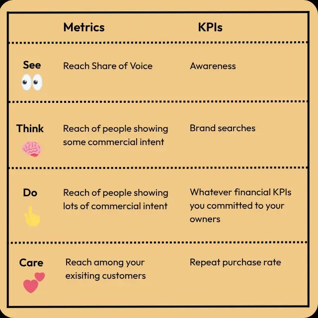
- Roofing customers make decisions based on urgency and trust. Storm damage creates immediate need, while planned replacements involve months of research and multiple contractor comparisons.
- Local visibility matters more for roofers than almost any other industry. Homeowners rarely hire contractors outside their service area, making hyper-local SEO and Google Business Profile optimization essential.
- Your online reputation competes directly with word-of-mouth referrals. Homeowners check reviews before calling, and a strong rating can override even a neighbor’s recommendation.
- AI search tools now answer roofing questions like “how much does a roof replacement cost” before showing traditional results, changing how you need to structure content to get cited.
- Roofing marketing must address both emergency repairs and planned replacements. Your strategy needs to capture homeowners searching “roof leak repair now” and those researching “best roofing materials” six months before they’re ready to buy.
Why Do Roofing Businesses Need Marketing?
72% of roofing contractors expect sales growth in 2025, but hoping for growth and planning for it are two different things. Marketing is about making sure you’re visible when a homeowner’s roof starts leaking or when they’re ready to replace those 20-year-old shingles.
67% of homeowners say online reviews are extremely or very important in their purchasing decision. That means your reputation online matters just as much as the quality of your work. Maybe more, because prospects check your reviews before they ever meet you. When you look for a roofer in your area, reputation signals like ratings and reviews are front and center in the SERP.

Marketing also keeps your pipeline full during slow seasons. Storm damage creates spikes in demand, but you need a steady flow of leads year-round to keep crews working and revenue stable. Without marketing, you’re reactive. With it, you’re in control.
The roofing companies that invest in marketing don’t just survive. They grow, scale, and dominate their local markets. The ones that don’t? They’re competing on price alone, and that’s a race to the bottom nobody wins.
What Makes Roofing Marketing Unique?
Roofing sits at an unusual intersection in home services. Half your leads need you right now because of storm damage or leaks. The other half are planning six months out, researching materials and comparing quotes.
Most roofing demand comes from re-roofing, with the median U.S. home age nearing 40 years. That creates a predictable replacement cycle, but it also means homeowners treat roofing as a major investment. They’re not impulse buying. They’re checking multiple contractors, reading dozens of reviews, and asking neighbors who they used.
Trust matters more in roofing than almost any trade. You’re asking homeowners to spend $15,000 to $30,000 or even more on something they can’t see once it’s installed.
The buying cycle also varies wildly. Emergency repairs convert in hours. Full replacements take weeks or months of consideration. Your marketing needs to serve both audiences without confusing either one.
Digital Marketing Strategies For Roofing
The tactics below aren’t theory. They’re what actually works for roofing companies competing in local markets right now.
Each strategy addresses a specific part of the customer journey. LLM marketing and SEO capture homeowners in research mode. Paid ads grab emergency leads when speed matters. Social media and content build trust over time. Email nurtures prospects who aren’t ready to buy today. Reputation management turns past customers into your best salespeople.
You don’t need to master all of these on day one. Start with the channels where your best customers are already looking, then expand as you see results.
Roofing SEO
SEO puts your roofing company in front of homeowners during their research phase, weeks or months before they’re ready to get quotes. 76% of people who search on their smartphones for something nearby visit a business within a day, making local SEO critical for roofing contractors competing in specific service areas. Businesses that appear in the Google 3-pack see a 34% higher click-through rate compared to other organic results.
Here’s what drives SEO results for roofing companies:
- Optimize your Google Business Profile completely. Fill out every section of your Google Business Profile, choose “Roofing Contractor” as your primary category, add secondary categories like “Roof Repair Service” or “Metal Roofing Company,” and upload photos weekly.

- Target service-specific local keywords. Create separate pages for “roof replacement [city],” “storm damage repair [city],” and “roof leak repair [city].” Don’t lump all services onto one generic page. Homeowners search for specific solutions in specific locations.
- Build consistent local citations. List your business on Angi, HomeAdvisor, BBB, and roofing-specific directories with identical NAP (Name, Address, Phone) information everywhere. Inconsistent listings confuse Google and hurt rankings.
- Create location-specific content for each service area. If you serve multiple cities, build individual pages for each location with unique content about local roofing challenges, weather patterns, and building codes. Don’t just swap city names in template pages.
Roofing Social Media
Social media isn’t optional for roofing companies anymore. Social media content now ranks prominently in Google search results, meaning your Facebook posts and YouTube videos can appear when homeowners search for roofing services. 89% of consumers will buy from a brand after following it on social media.
Some roofing companies might avoid social media because they don’t want to be on camera or don’t know what to post. But social media isn’t about you. It’s about showing homeowners what to expect and staying top of mind when their roof needs work.
Here’s how roofing companies should use social media:
- Post project transformations consistently. Before-and-after photos of completed jobs prove you can solve problems. Show storm damage repairs, full replacements, and material upgrades. Too much promotional content is a major turn-off, so focus on showing your work, not selling your services.

- Feature your crew, not just roofs. Show your team working safely, explain the process, and humanize your brand. Homeowners hire people, not companies. Let them see who shows up to their house.
- Create educational content about local roofing issues. Post about how local weather affects roofs, when to replace vs. repair, and what homeowners should look for during inspections. Educational content positions you as the expert.
- Respond to comments and messages immediately. Social media is a customer service channel. Homeowners asking about pricing or availability in your comments expect fast responses. Slow replies lose jobs to competitors.
Roofing Content Marketing
Homeowners research roofing projects for months before hiring a contractor. Content marketing puts your company in front of them during that research phase, building trust before they’re ready to get quotes.
Content works differently for roofing than other industries. It’s not about entertainment. You’re educating homeowners who need to make a major financial decision about something they don’t understand. Most people replace a roof once or twice in their lifetime. They don’t know what questions to ask.
Here’s what roofing content should cover:
- Create buying guides specific to your region. Write about which roofing materials work best in your local climate, how local weather patterns affect roof lifespan, and what building codes homeowners need to know. A guide for Florida roofs looks completely different than one for Colorado.

- Break down the replacement process. Explain timeline expectations, how crews protect landscaping, what noise levels to expect, and how homeowners should prepare. Demystifying the process reduces anxiety and objections during sales calls.

- Address insurance and financing. Homeowners want to know if insurance covers storm damage, how to file claims, and what financing options exist. Content that answers these questions captures leads who are ready to move forward but need help with payment logistics.
- Show your work through project galleries. Before-and-after photos with detailed captions explaining the problem, solution, and materials used build credibility better than any sales copy.

Roofing Paid Media
Paid ads put your roofing company in front of homeowners at the exact moment they need help. When someone searches “roof repair near me” at 8 AM after a night of heavy rain, that’s not casual browsing. That’s intent. PPC advertising captures those high-intent leads before they call your competitors.
For roofing and gutters, the average cost per click can be expensive compared to other home services, but the payoff justifies the cost. Well-optimized campaigns can bring in up to $8 for every $1 spent, especially during storm season when demand spikes.
Here’s how to make paid ads work for roofing:
- Separate emergency from planned replacement campaigns. Someone searching “roof leak repair now” needs different messaging than someone researching “best roofing materials.” Create distinct campaigns for each stage of the buying cycle with appropriate landing pages when someone clicks through from a paid ad. The examples below show that path down the sales funnel.


- Use location targeting aggressively. Bid higher on zip codes you actually service. Storm-damaged areas command premium ad costs, but they also convert faster. Adjust bids based on weather patterns and recent storm activity.
- Track phone calls, not just form fills. Most roofing leads call directly from mobile search results. Set up call tracking so you know which keywords and ads generate actual conversations, not just website visits.
- Add negative keywords religiously. Exclude searches for “DIY roof repair,” “roofing jobs,” and “roofing materials wholesale” unless you serve those markets. Wasted clicks drain budgets fast in high-CPC industries like roofing.
Roofing LLM Marketing
AI SEO for roofers helps roofing companies appear in answers from large language models like those that power ChatGPT, Perplexity, and Google’s AI Overviews. When a homeowner asks “What should I do about a roof leak?” or “How much does a roof replacement cost?” they’re not always clicking through to websites anymore. They’re getting answers directly from AI.
Market projections suggest that LLMs will capture 15% of the search market by 2028. That’s not replacing Google, but it’s changing how homeowners research roofing services before they ever pick up the phone.
When homeowners search for roofing services, AI-generated overviews now often appear before traditional search results, answering questions with cited sources. Getting your roofing company included in those citations means more visibility even when prospects don’t click through to your site.

Here’s what works for roofing companies optimizing for AI search:
- Answer specific questions directly. Create content that addresses exact homeowner concerns like “How long does a roof replacement take?” or “What causes shingles to curl?” AI tools favor sources that give clear, complete answers.
- Use structured data. Add FAQ schema and How-To schema to your pages. This helps AI understand what your content covers and makes it easier to cite you as a source.
- Build topical authority. Cover one roofing topic completely rather than surface-level content on 20 topics. Write comprehensive guides on roof types, materials, and local weather considerations specific to your service area.
- Keep information current. AI tools generally pull from fresh, accurate content. Update your pricing guides, material comparisons, and storm preparation advice regularly with current information and timestamps.
Email Marketing For Roofing
Most roofing jobs don’t happen immediately. Homeowners research for months before getting quotes, then take more time comparing contractors. Email keeps your company in front of prospects during that entire decision-making process without requiring constant manual follow-up.
Email marketing is one of the highest ROI channels for roofing companies. Unlike social media where algorithms control visibility, email lands directly in the inbox of people who actually want to hear from you.
Here’s how to use email marketing for roofing:
- Segment your list by customer type. Emergency repair leads need different messaging than planned replacement prospects. Past customers get maintenance reminders. Property managers receive commercial service updates.
- Send seasonal maintenance reminders. Email past customers before storm season with inspection offers. Send fall gutter cleaning reminders. Winter ice dam prevention tips. Timely, helpful emails keep you top of mind when they need work again.
- Nurture leads who requested quotes but didn’t book. Set up automated follow-up sequences for prospects who got estimates but haven’t committed. Share financing options, customer testimonials, and limited-time offers to move them toward a decision.
- Build your list with valuable content. Offer free roof inspection checklists, seasonal maintenance guides, or storm damage assessment tools in exchange for email addresses. Gated content attracts qualified leads who are actively researching roofing services.
Roofing Reputation Management
Your reputation online directly impacts whether prospects call you or your competitor, especially when considering high-stakes decisions like roofing. Reputation management for roofing companies means actively controlling what homeowners see when they research your business. One bad review on the first page of Google can cost you thousands in lost jobs.
Here’s how to manage your roofing reputation:
- Ask for reviews immediately after job completion. Send a text or email with a direct link to your Google Business Profile while the customer is still happy. Timing matters. Ask three days later and response rates drop significantly. Be sure to have a section for relevant testimonials on your site as well.

- Respond to every review, good and bad. Thank customers for positive reviews and mention the specific project. For negative reviews, acknowledge the issue publicly, explain what happened, and offer to make it right. Future prospects read your responses.
- Monitor review sites beyond Google. Track Angi, HomeAdvisor, BBB, Facebook, and Yelp. Homeowners check multiple platforms before calling, so you need consistent positive reviews everywhere.
- Address negative reviews offline first. Call unhappy customers before they leave public reviews. Solve the problem directly. Many will update or remove negative reviews if you fix the issue quickly.
Measuring Your Roofing Marketing Success
You can’t improve what you don’t measure. Marketing without tracking is just hoping things work. What you are looking to focus on may vary based on short-term and long-term goals.
Track these metrics to understand what’s actually driving results:
- Cost Per Lead (CPL): Divide total marketing spend by number of qualified leads in your service area who are ready to book. If you’re spending $500 per lead when competitors spend $150, something’s broken.
- Lead-to-Customer Conversion Rate: How many leads become paying customers? Even a slight improvement from 2% to 4% can double your leads without increasing traffic. Track this by marketing channel to see which sources close.
- Return on Ad Spend (ROAS): For every dollar spent on paid ads, how much revenue comes back? If you’re spending $5,000 monthly on Google Ads but only booking $3,000 in jobs, you’re burning money.
- Website Conversion Rate: Track phone calls and form submissions separately. Most roofing leads call directly from mobile search, so call tracking matters more than form fills.
Use Google Analytics, call tracking software, and your CRM to monitor these metrics monthly. Set up dashboards showing performance by channel so you can cut what doesn’t work and double down on what does.
FAQs
How do I market a roofing company?
Start with local SEO and Google Business Profile optimization since most homeowners search for roofers nearby. Get reviews systematically after every job. Run Google Ads targeting emergency repair keywords and service-specific terms in your area. Post project photos and educational content on social media. Build an email list to nurture leads who aren’t ready to book immediately. Track which channels produce the best leads and focus your budget there.
What is roofing marketing?
Roofing marketing is the process of attracting homeowners who need roof repairs, replacements, or inspections and converting them into paying customers. It combines local SEO, paid advertising, content creation, social media, email marketing, and reputation management to capture leads at different stages of the buying cycle. Effective roofing marketing addresses both emergency repair needs and planned replacement projects with different strategies for each.
Conclusion
Roofing marketing isn’t about choosing one tactic and hoping it works. It’s about building a system that captures homeowners at every stage, from the first Google search to the follow-up email six months later.
Start with what matters most for roofing: local visibility. Optimize your Google Business Profile, get reviews, and make sure you show up when homeowners search for help. Layer in paid ads for emergency leads and content for long-term trust building.
The roofing companies winning in 2025 aren’t the ones with the biggest trucks. They’re the ones who show up first online, prove they’re trustworthy before the phone rings, and stay in touch until homeowners are ready to buy.
Need help building a complete marketing strategy? My marketing consulting services can help you dominate your local market.
Read more at Read More


